
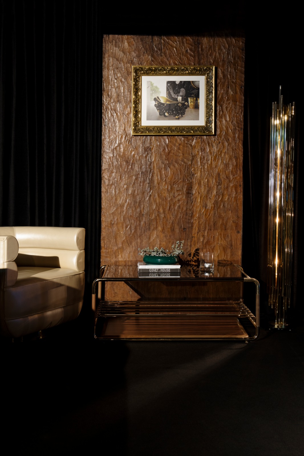
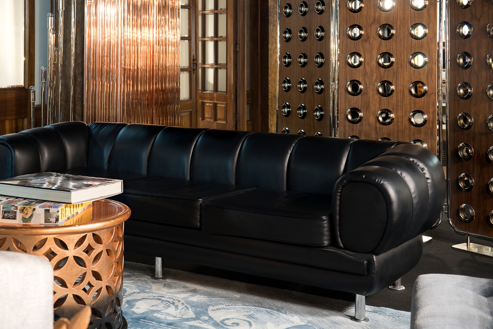
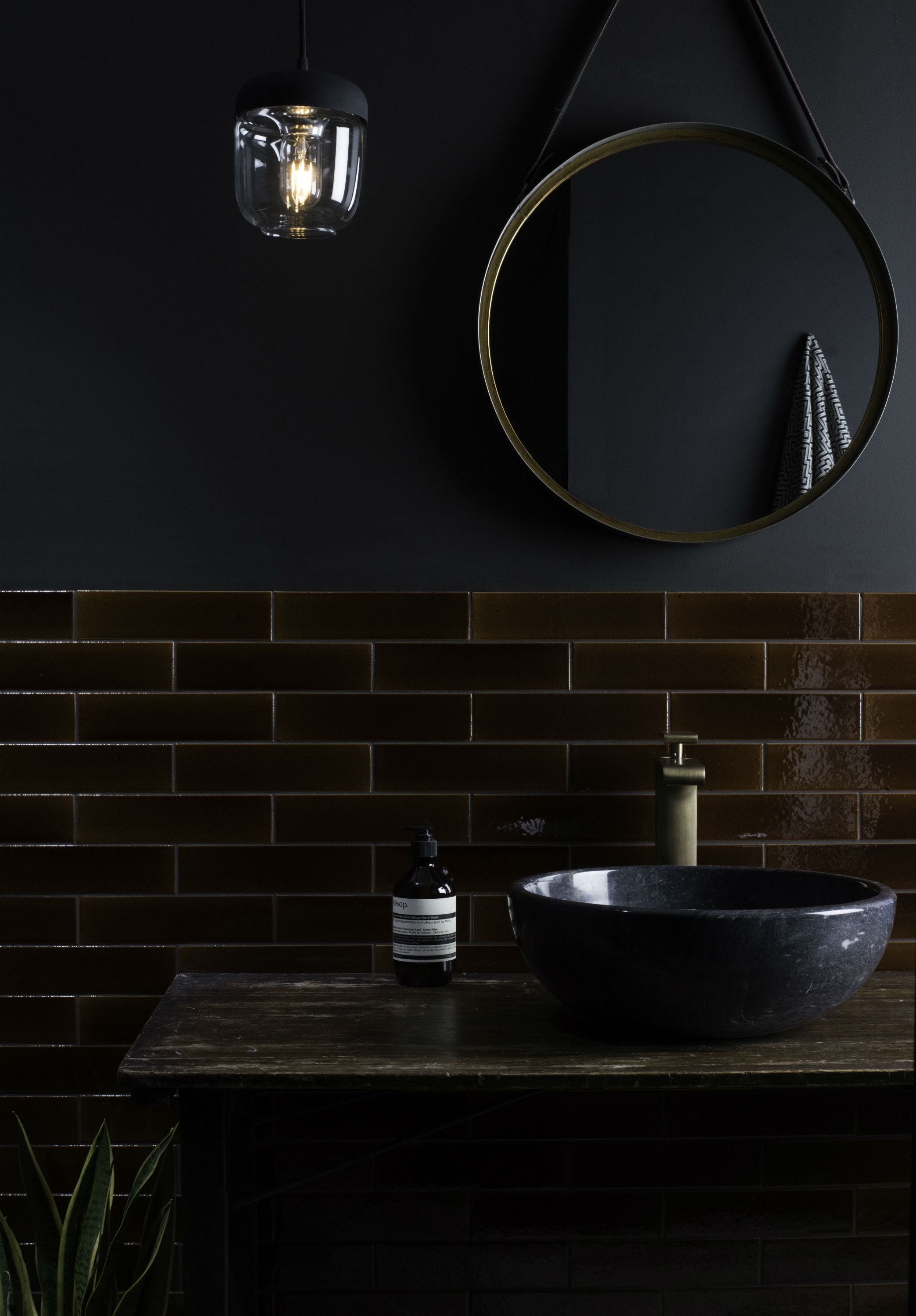
Dark tones are in. Whether in the form of jewel-toned pieces or jet black items, opting for darker tones can add a sense of decadence to your interior.
This trend sees an abundance emeralds, burgundies and blacks being incorporated into homes, often by use of dark furniture, accessories, and wall paint. This sophisticated yet comforting interior trend is perfect for the cozy winter months. But it’s also set to continue as a trend as we go into spring and summer, adding an element of sumptuous to the brighter half of the year. Here are few ways to incorporate dark tones throughout your home this spring.
COFFEE TABLE
Lautner is a coffee table that stands out for its curved edges, mixing earth-tone colors from the varnished walnut wood and polished brass. Its artisan quality and crafted work provides a striking centerpiece for your living room. It has a moody smoked glass on the top and a shelf at the base that offers additional storage.
Credit of Essential Home
SOFA
Novak is a sofa that combines some details from Mid-Century style with a Contemporary design vision. The base is rectangular, but it has a contrasting low back with rounded shapes, upholstered with a sophisticated leather and finished with piping detail.
Credit of Essential Home
TILE
This beautiful range of glazed brick tiles by Original Style are unique in many ways. The shades are inspired by the English countryside, from the blues of the sea to the earthy greens and warm browns of the English landscapes. Credit of Original Style

SIDEBOARD
The elegant Darian sideboard stands out in any interior. A rich combination of the best materials and irregular shapes blended together with the precise knowledge of the craftsman techniques grant this radiant sideboard, that also offers plenty of storage, timeless aesthetics.
Credit of LUXXU Home
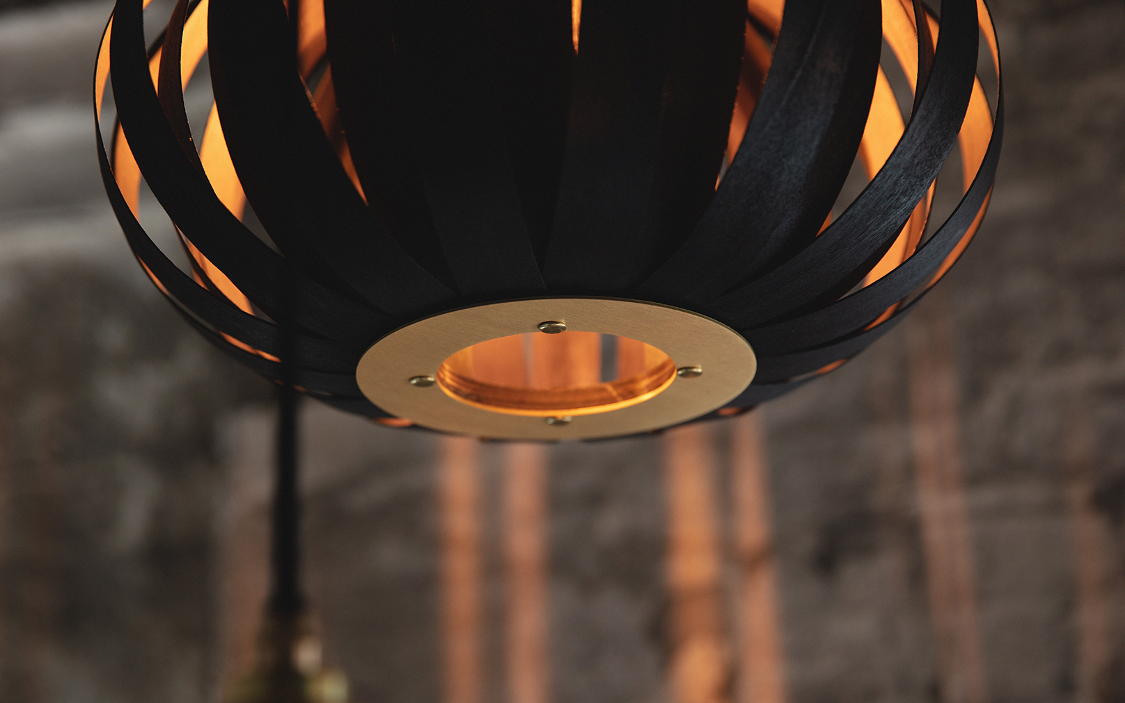
LIGHTING
The Noctis Urchin Cluster Light is comprised of three ebonised Noctis Urchin Pendants. With an elegant, customisable design that invites personalization, each pendant can be suspended at a different height allowing a showstopping configuration to take charge of your space. Credit of Tom Raffield
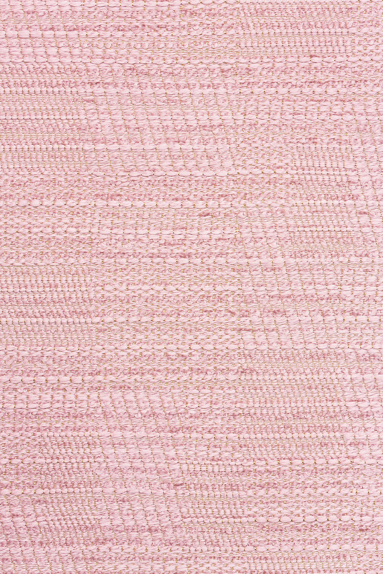
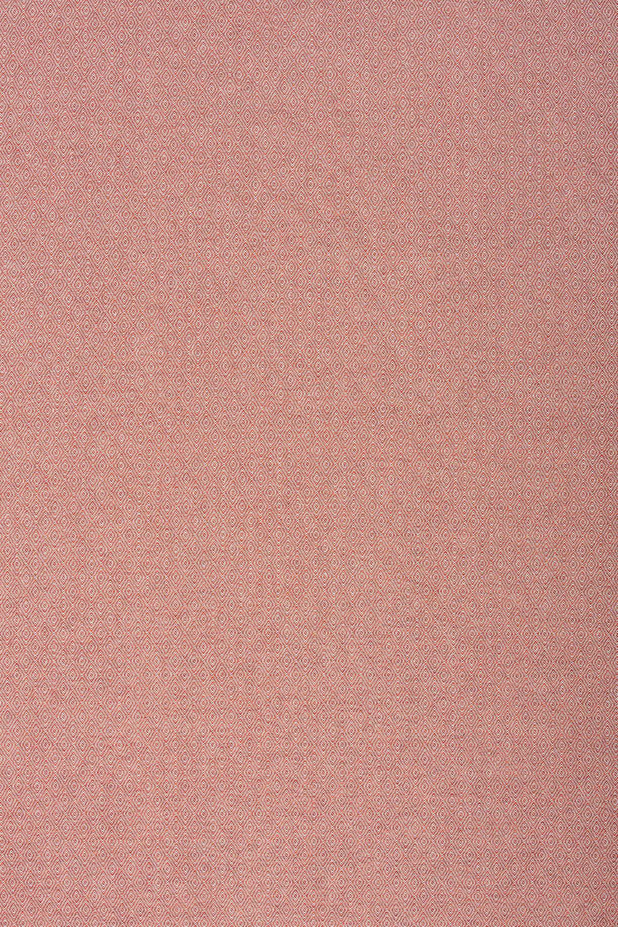
Nude shades can add warmth and subtle sophistication.
Whether it be an accent piece or the color of the whole room, nude tones add subtle warmth to any living space in need of an update. Calming, earthy shades of beige, pale pink and light caramel can set a refreshing tone with barely-there hints of these trendy colors.
Nude shades work particularly well in living rooms and bedrooms, but nude-colored kitchen walls can also set a friendly and inviting vibe in contrast to past trends of gray, black and white. Since most neutral tones pair well together, shades of light pink, brown and even some very light blues can be mixed together to create your ideal wall color.
Photo by MADE.com
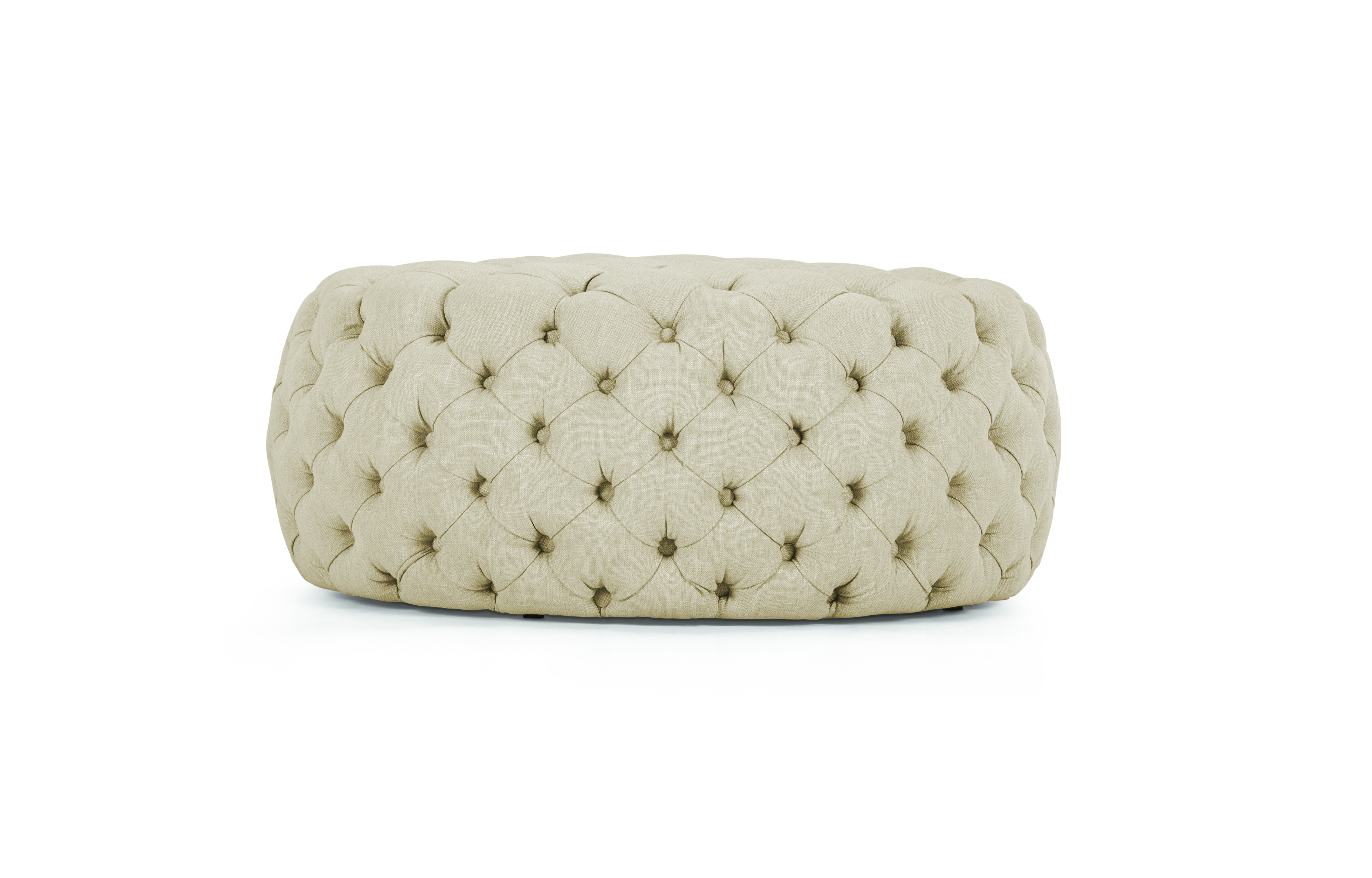
Photo by MADE.com.
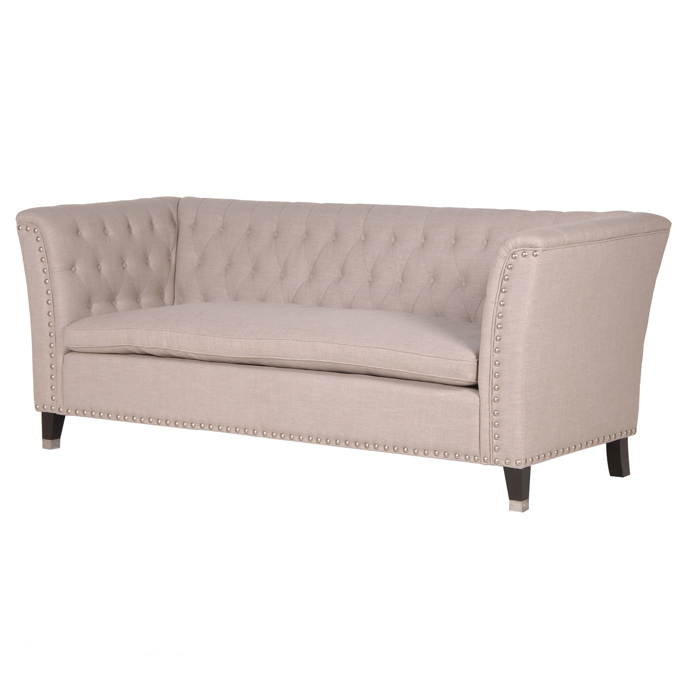
Photo by Sweetpea & Willow.
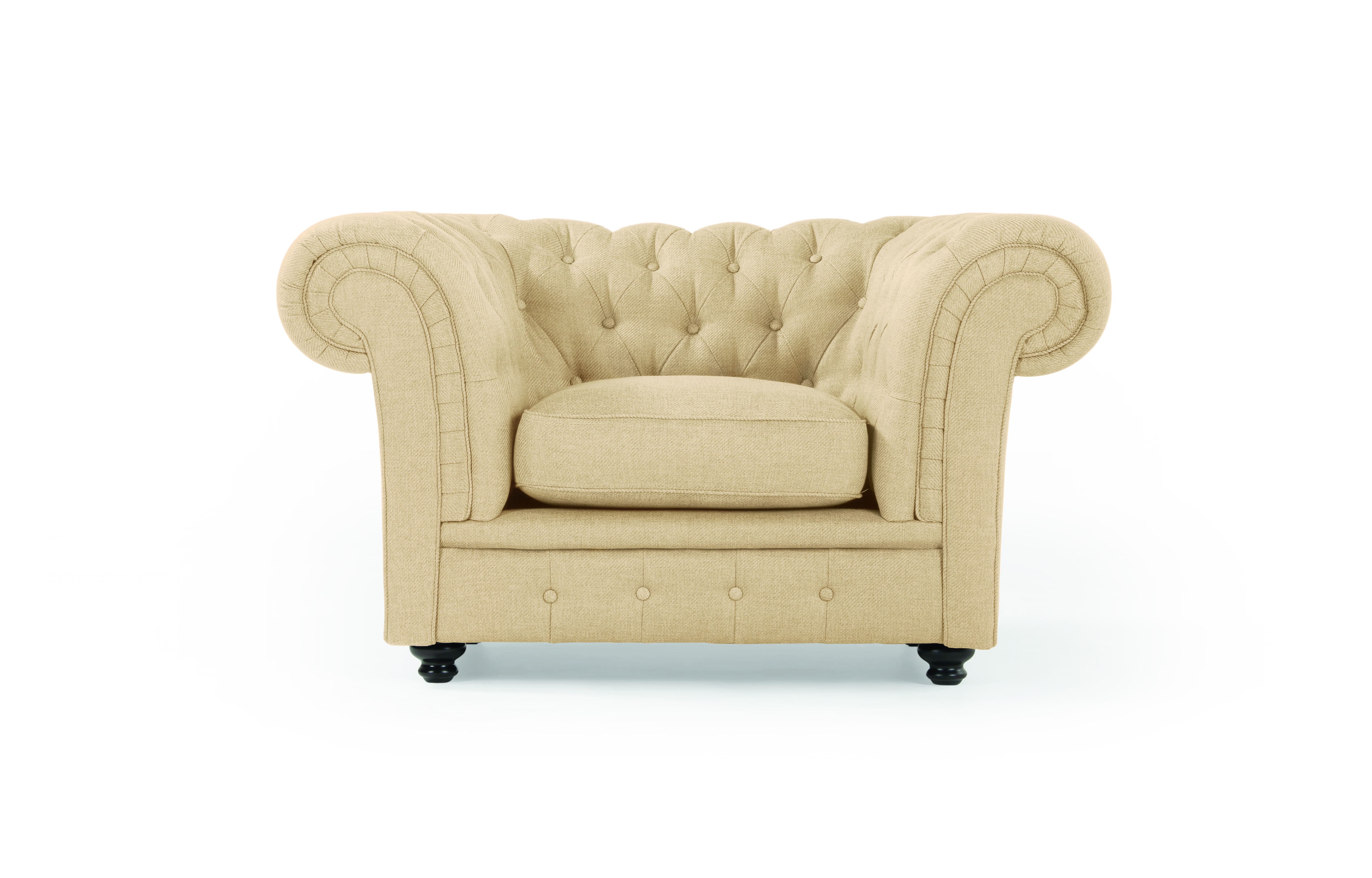
Photo by MADE.com.
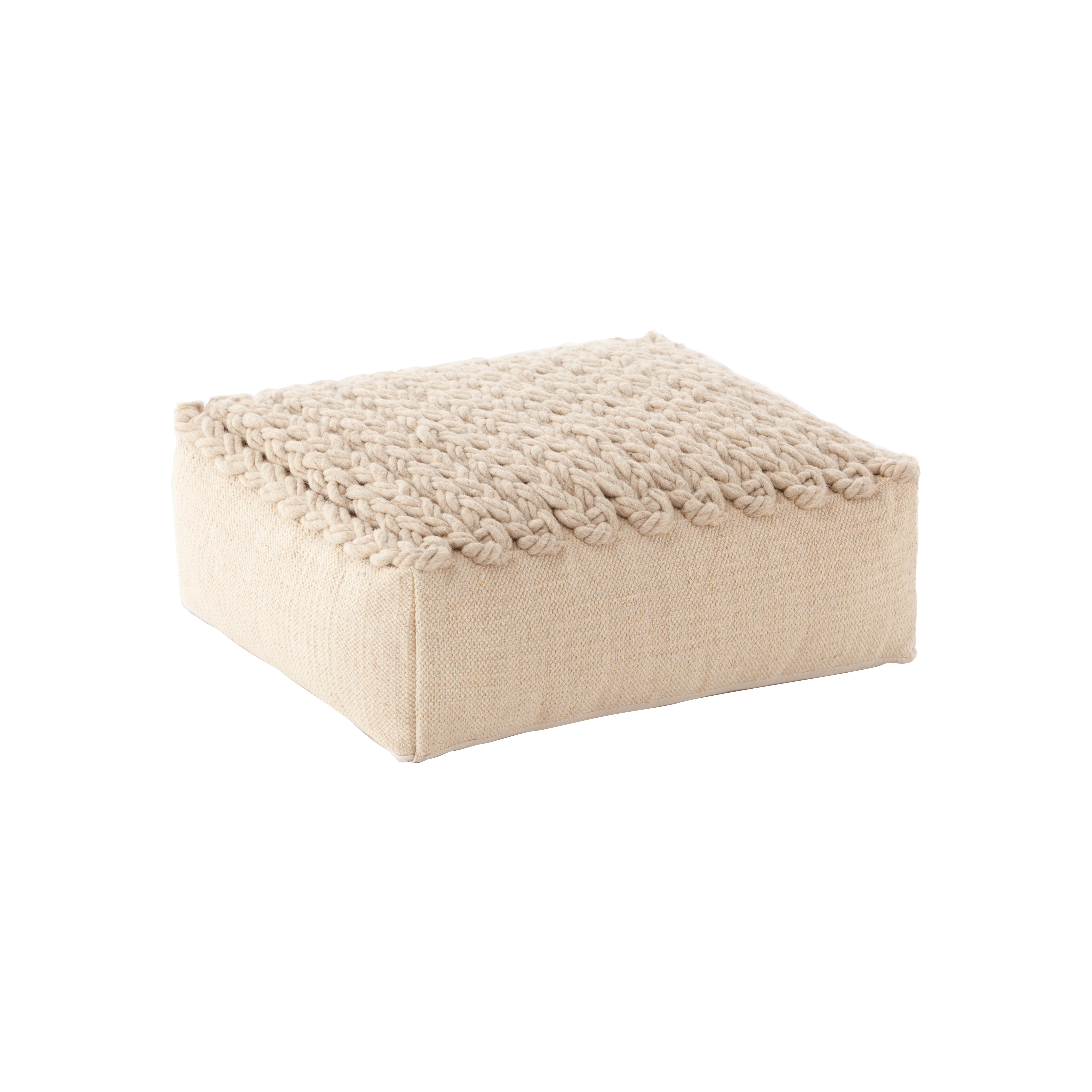
Photo by Chaplin Furniture.
Nude-colored furniture — particularly seating, rugs, and accent pieces — add a touch of understated glamour to a bland room in need of color. These muted shades of beige and pink add a soft pop of vibrance on their own, but can also serve as the backdrop for a more boldly colored accent pillow, curtains or piece of wall art. Try pairing a sand-colored sofa with wine-colored cushions to add depth to your living room.
There is no need to stick to one shade when adding nude colors to a room — try adding a pale pink couch to a room with beige walls, or light caramel ottoman to a linen-colored living room. The variety of hues will make the room more intriguing.
Without creating a convoluted or gaudy aesthetic, nude shades add warmth to spaces that lack personality. Maintaining a clean and chic vibe, they are the ideal interior design choice for a homeowner in search of subtle sophistication.
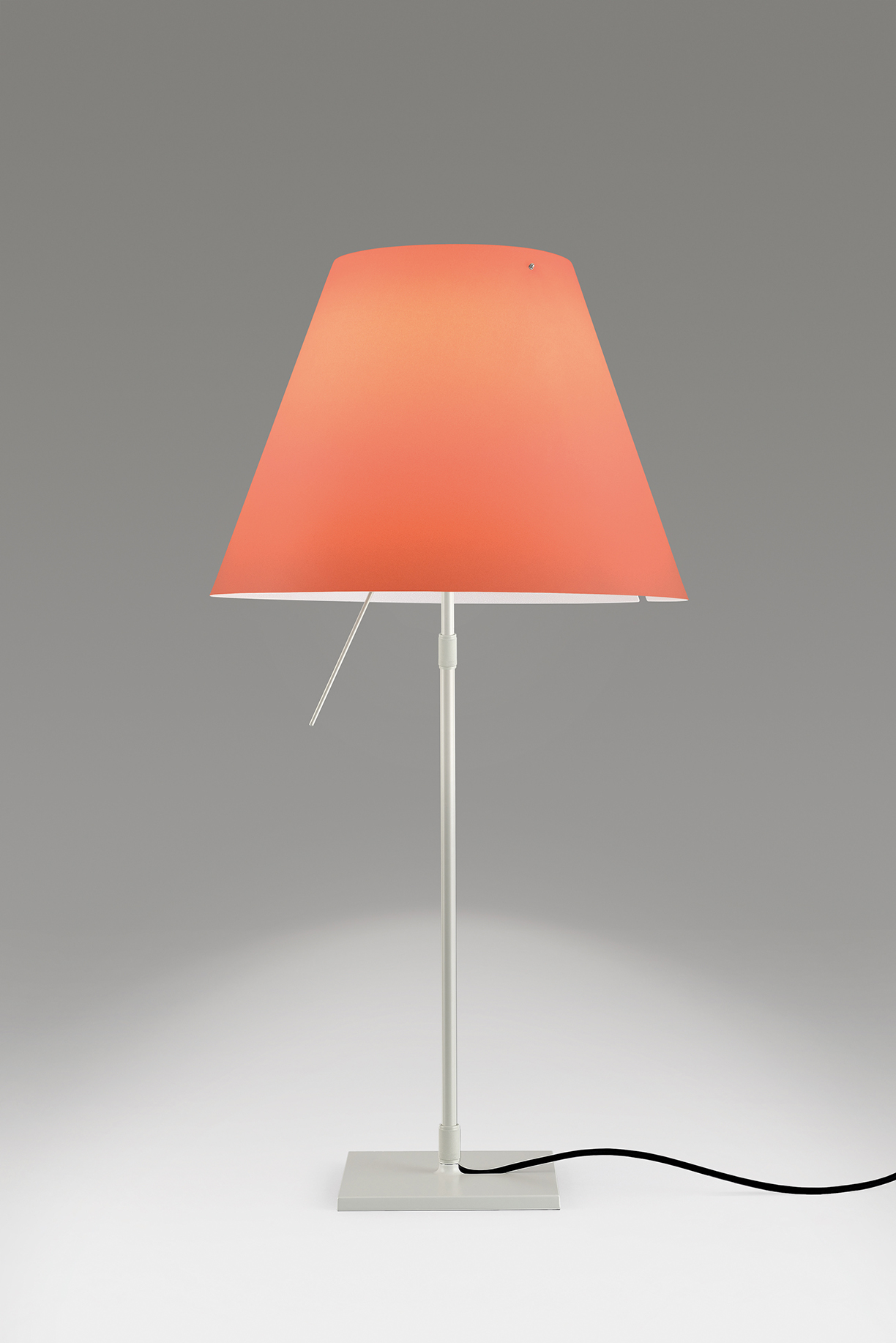
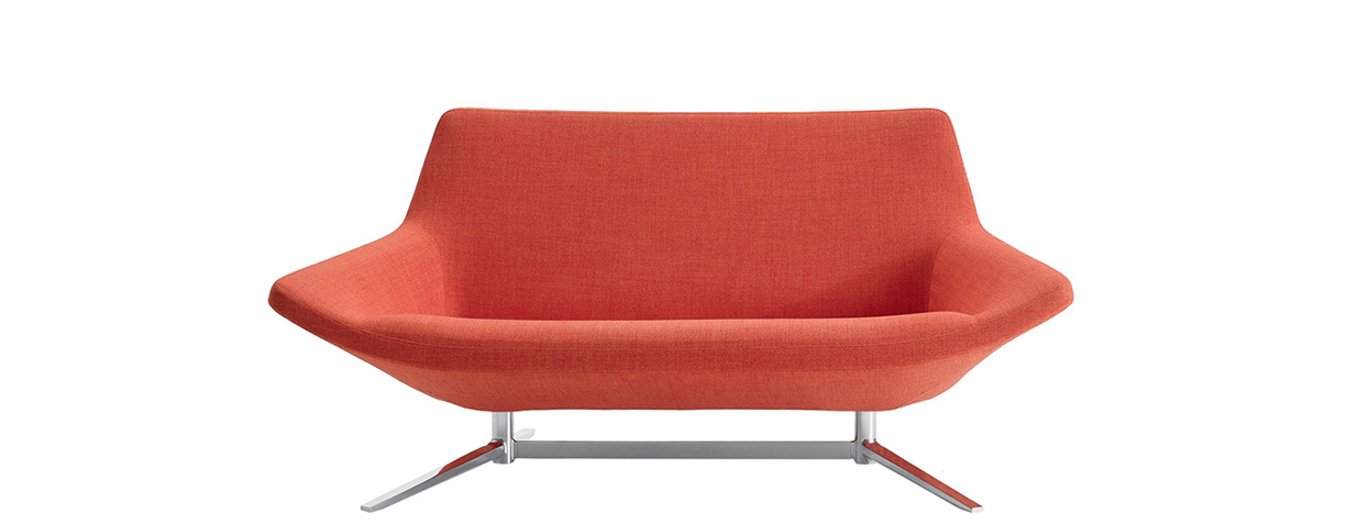
The Pantone Color Institute has named 2019’s Color of the Year — Living Coral, an animating coral hue with a golden undertone that energizes and enlivens with a softer edge.
Vibrant, yet mellow PANTONE Living Coral embraces warmth while providing comfort and buoyancy.
The Color of the Year selection process requires thoughtful consideration.
To arrive at the selection each year, Pantone’s color experts at the Pantone Color Institute comb the world in search of new color influences.
Each year, Pantone is influenced by diverse industries — including the entertainment industry and films in production, traveling art collections and new artists, fashion, all areas of design, popular travel destinations, as well as new lifestyles, playstyles, and socio-economic conditions.
Influences may also stem from new technologies, materials, textures, and effects that impact color, relevant social media platforms and even upcoming sporting events that capture worldwide attention.
In turn, the Color of the Year has influenced product development and purchasing decisions across industries for 20 years — from fashion, home furnishings, and industrial design, to product, packaging, and graphic design.
This year, PANTONE Living Coral will embody a sociable and spirited energy, encouraging light-hearted activity and symbolizing our need for optimism and joyful pursuits.
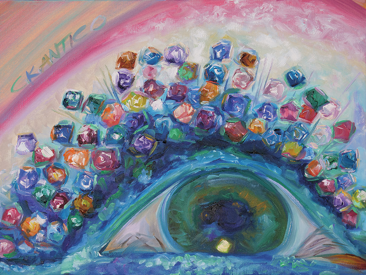
Artist Concetta Antico sees the world in 100 million colors.
Concetta Antico sits down for lunch at a local cafe, after settling on smoked salmon and a strawberry salad. Before eating, she takes a moment to acknowledge the array of color in front of her: the blue-violet of the salmon, the thousands of reds bouncing around the strawberry and the light turquoise surrounding the seeds. “I promise you, I am not high!” she says, “I just truly see what I am looking at.”
Super Vision Mutation 12 X 16
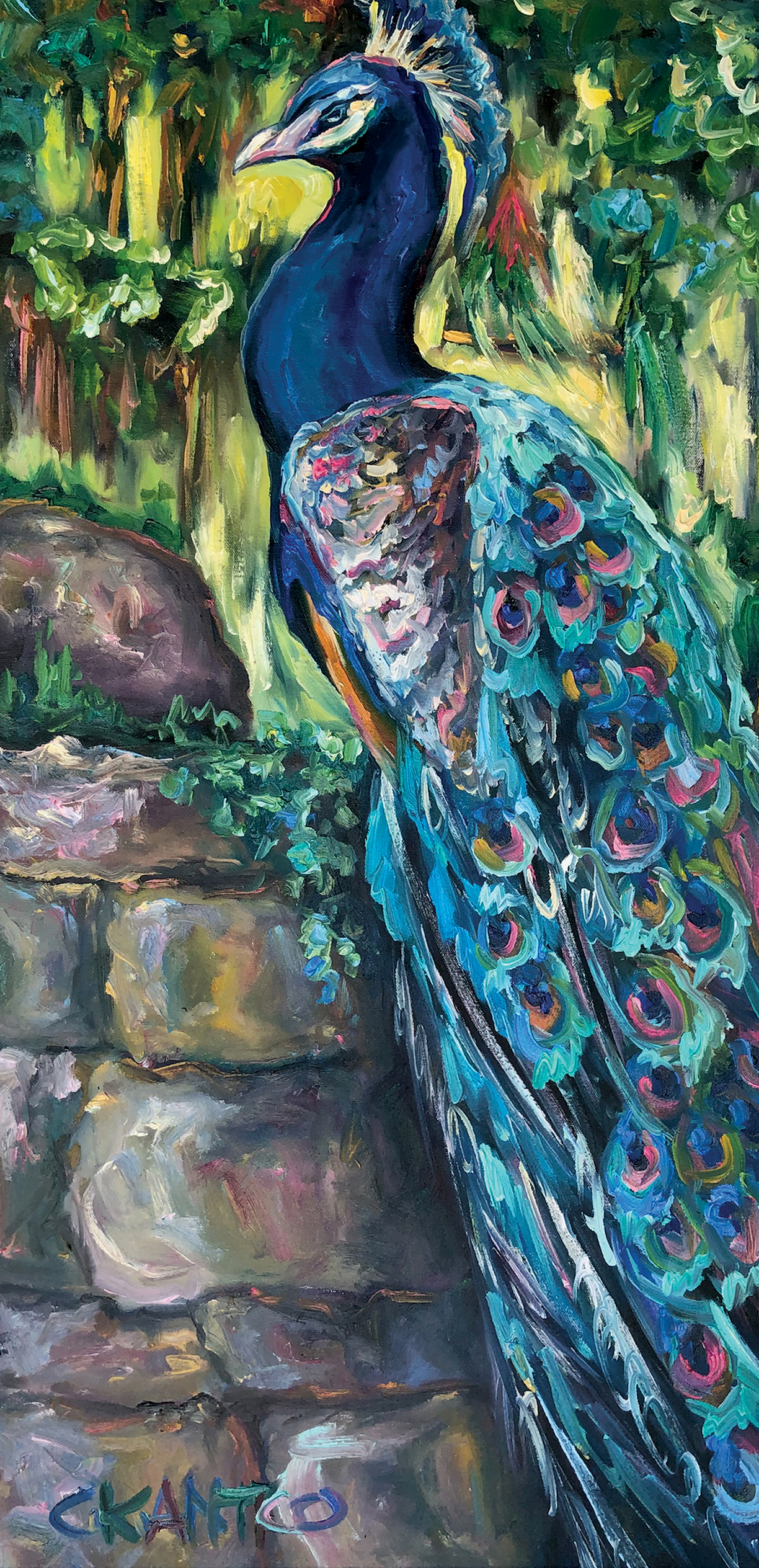
Persephones Peacock in the Garden of Paradise 8 X 36
Better known as “The Color Queen,” Antico sees pinks, blues and violets in the green grass, an array of colors glistening off the white snow, and hundreds upon hundreds of colors within a rainbow. And they’re not just a figment of her imagination: her rare, genetic gift of heightened sight allows her to see almost 100 million more colors than what meets the average human eye.
In addition to being an artist, teacher, and color consultant, Antico is what scientists call a “tetrachromat,” meaning Antico’s eyes contain a rare genotype that provides a fourth receptor as opposed to the usual three, more common in women than men. With this, Antico’s tetrachromatic potential reaches up to 100 million colors, 10 times more than the average 1 million.
For now, Antico is the only authenticated tetrachromat artist on Earth, with 1,000 internationally acclaimed pieces of art and features in Reader’s Digest, Vogue, New York Magazine, and more.
Antico is originally from Australia, and was drawn toward art and color at a very young age. At age 8, her mother recognized her potential to become a famous artist, constantly showing support for Antico’s art. At age 16, she left home to cope with her mother’s passing, winding up in Los Angeles.
“I am a bit of an adventurer,” she says, “Sydney got too small for me. I was heading to work in Canada, I stopped in L.A., and it entranced me.”
Despite her hardships, she always kept her deep passion for art at the forefront of her life and career. Antico knew she was meant to paint professionally, and so she began teaching in San Diego, ultimately instructing 25,000 budding artists in oil painting.
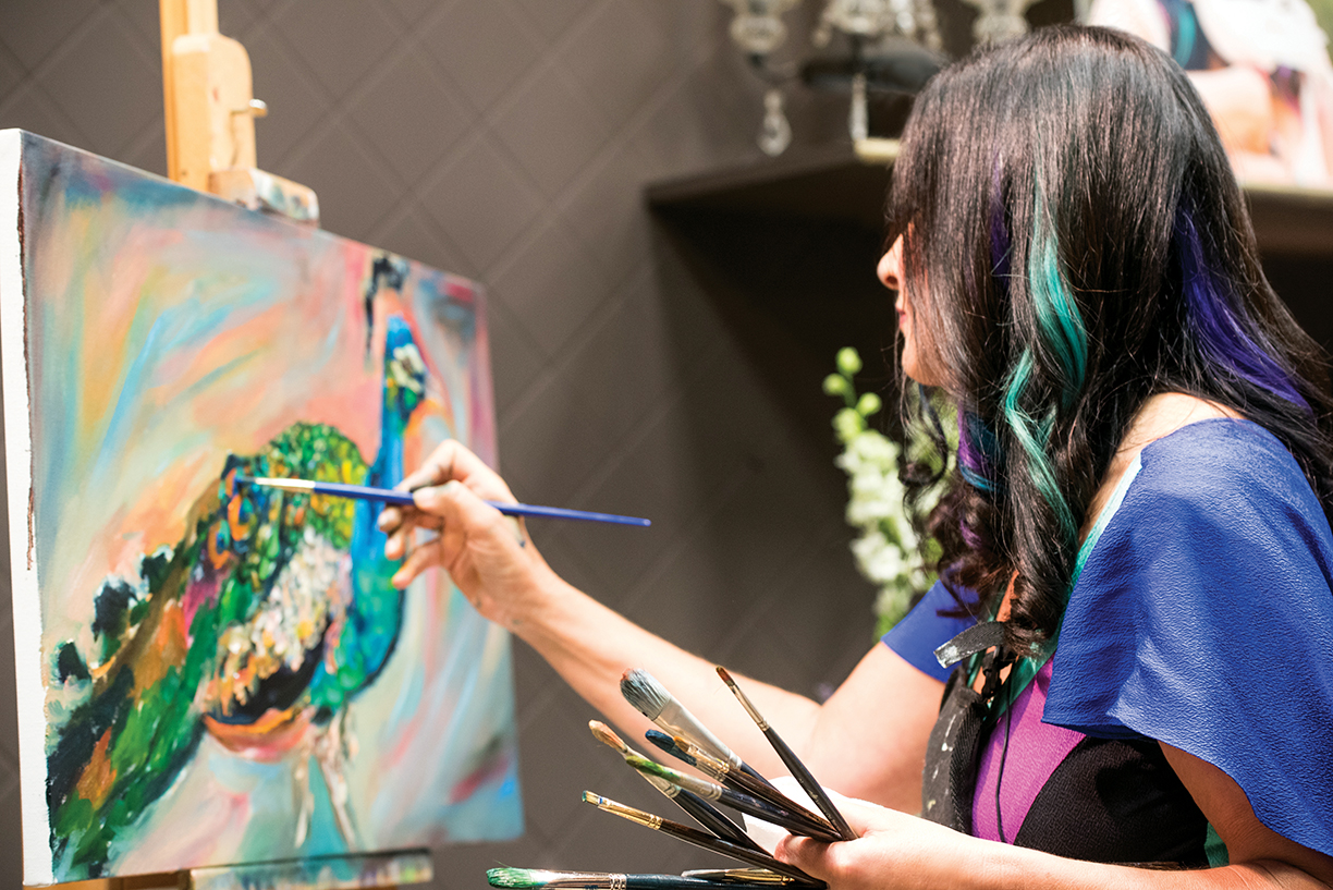
Artist Concetta Antico works on a piece named Iridescent Eyes… Charlie The Peacock 18 X 36
“Oil painting makes you healthier, and if we surround ourselves with beauty and happy spirits, we will be in a constant state of color euphoria.”
While teaching, Antico would point out the colors she sees in everyday objects and receive mixed reactions from her students. She says, “My students would tell me, ‘We don’t see that color that you see!’ I’d be confused, but then I educated my students to see a little more color.”
It wasn’t until a buyer of Antico’s, who happened to be a scientist, realized Antico could be a tetrachromat. Then, she began to understand her ability to see millions of colors. “I always thought I was different and unique,” says Antico. “The way I do things, what compels me, the way I painted … I didn’t realize that I could see and create colors like a computer.”
In late 2012, Antico was evaluated both genetically and behaviorally by Jay Neitz, Ph.D., a world-renowned leader in color vision. She soon discovered she was in fact a tetrachromat, and possessed an incredible genetic gift that affects only 2 to 3 percent of the world’s population.
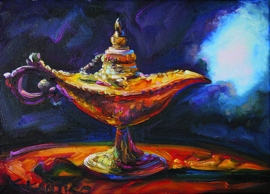
Who’s Your Genie 10 X 14
“It was just another part of the uniqueness of Concetta,” she says. “The gift is made up of my mother, her vision for me, how she put red and blue lights in the swimming pool to make lilac light, my high school that was big on art, my genetics, my brain, and my own passion, ambition and drive.”
Today, Antico wants to use her gift to make the world a better place, truly treasuring the world around her. In an interview with Stanford University, Antico said that, “enhanced color created enhanced joy.” She is constantly happy and joyful, happy to wake up and see trees and sun.
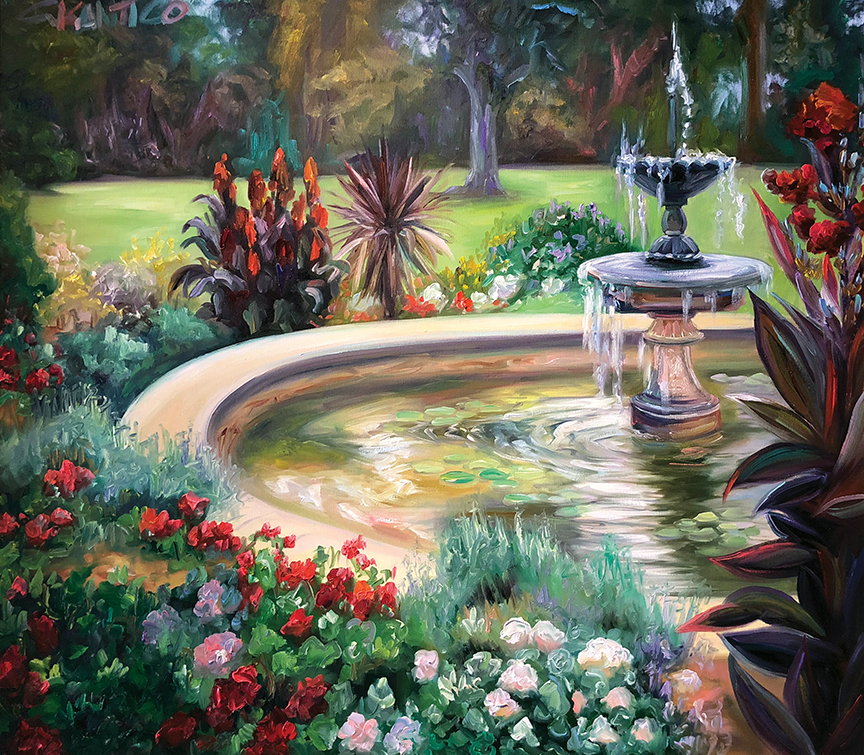
Reflecting Pool of Narcissistic Love-Vaucluse House-Sydney 30 X 36

“Oil painting makes you healthier, and if we surround ourselves with beauty and happy spirits, we will be in a constant state of color euphoria,” she says. “My gift makes me so excited to paint, look, share. Color has made me joyful, and has only enhanced my life. There are no disadvantages to beauty and color.”
Antico has a wide range of muses, as she aims to paint whatever captivates and moves her. Her paintings are divided into two categories: “earthly delights,” which encompasses everything on earth that she paints, and “otherworldly wonders,” which includes galaxies, magic and more. She often leans toward the ethereal subjects such as mystic skies and otherworldly galaxies. “Not people, though. We’re just not that attractive,” she jokes.
For those with normal sight, a place like a grocery store or a highway are simply as they seem. But for Antico, she is able to see past the veil and see further into the typical. “I’m captivated with the sky and trees beyond the freeway. I’m hyper-focused on beauty around me.” Sunsets, for example, are a religious experience for Antico, with the amount of splendor and color that they produce. “I am very blessed. I wake up every day and am so elated to see what I see and do what I do,” she says.
One of Antico’s main beliefs is that everyone has gifts, not just her, and that they should all be used to better our world. “Media can be dark, and we need light,” she says. “I want to use my platform for that. I have a place as ‘The Color Queen,’ and I feel that I can make people see their worlds differently.”
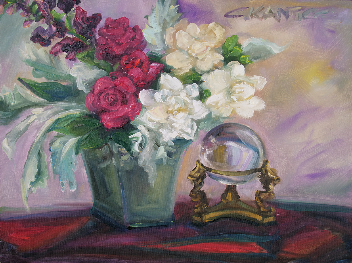
Conjuring Crystal Ball Colors 18 X 24
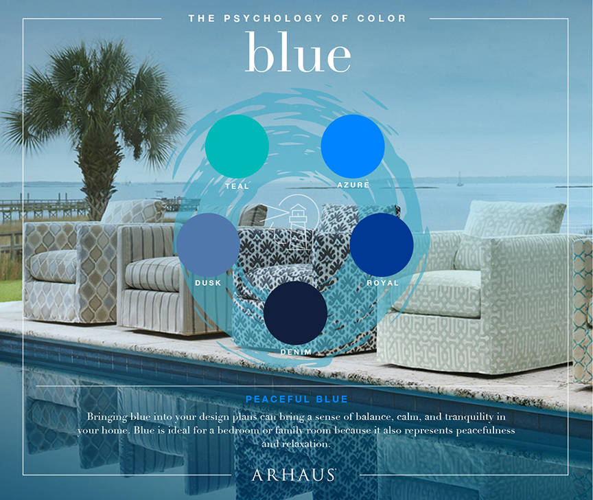
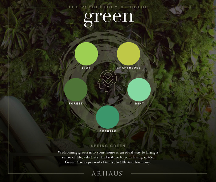
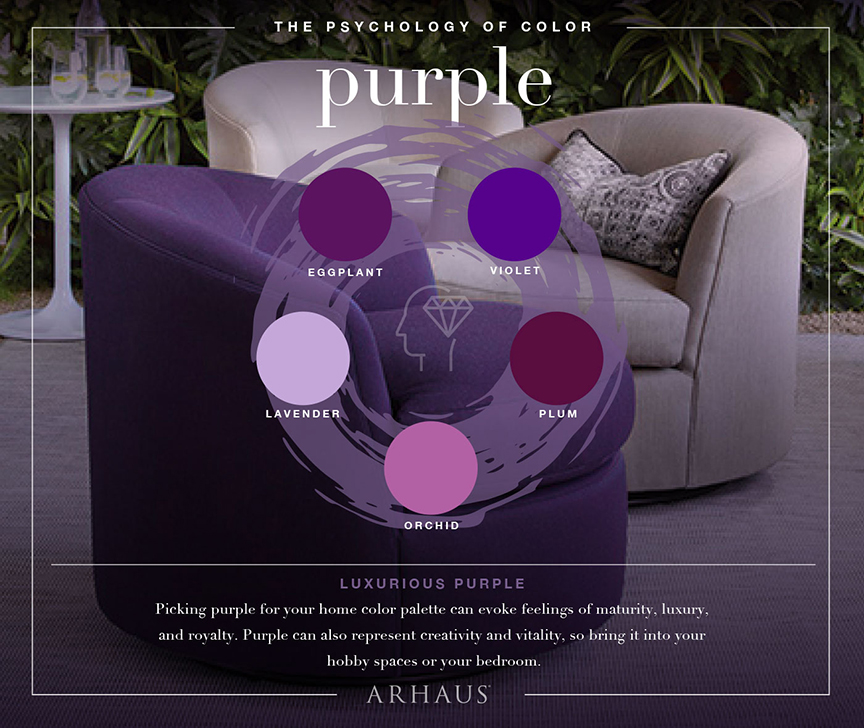
Whether you’re purchasing a new home or revamping your existing space, there are many different facets of decor theory to consider. One of the most important decisions to make is which colors you will utilize, a decision that will set the mood for your home. The savviest of designers and homeowners will consider the science of color, and further the psychology behind the way our brains interpret different hues and shades. When selecting a color scheme, it’s wise to understand the way these colors will make us feel. Whether working with shades of passionate red or warm tones of yellow, experts at Arhaus, an interior furnishing company, offer great tips on how to execute knowledge based on color psychology in interior design.
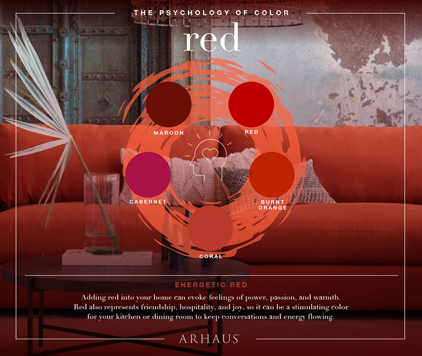
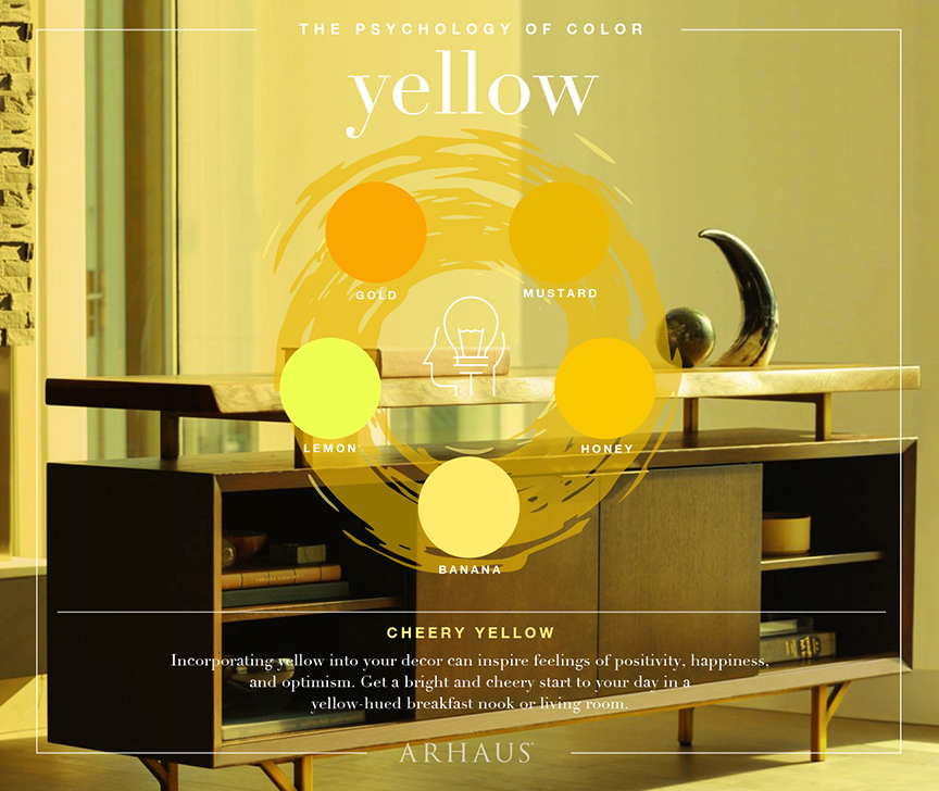
Start With Walls
Rooms with the absence of color, especially stark, white spaces with oppressive lighting, can make us feel uncomfortable. We have definitive reactions to color, especially on a subconscious level, so it is important to factor this in when deciding the layout and color scheme of room. Starting with the walls, try and think about the room’s intended purpose, and decide on paint color from there. Is this going to be a living room where the family relaxes as the long day is winding down? Or perhaps it’s a bedroom with a luxurious view of rolling hills or a coastline?
Due to the way that our brains process color, you will want to select a color that will promote a certain mood. Blues and greens can offer a feeling of relaxation, especially in rich, warmer shades. Blue is especially desirable in the bedroom as it can promote calmness and aid in sleep. Green traditionally is perceived as familial, which can be a great choice for a living room. Adding supplementary furniture, such as a patterned sofa or loveseat, can add to the mood of the room and help it become the ultimate room to spend time with the family.
Stock the Room
Surely, a chic and luxurious home will need furnishings; we can’t just live in an empty house! It is important to “stay within the lines” regarding furniture and decorative pieces. If you’re going for a rustic, mountain vibe, an abstract, post-modernist painting surely won’t pull the room together.
We can generally rely on our intuition when it comes to design, and when all else fails, go with pieces that you like! With that said, we must consider each item within the context of color scheme. Neutral colors, like browns, blacks, and grays, can be used to balance a room. Consider a brown or black exterior surface (especially fine cabinet wood), which can help to offset the color profile and bring the room a more subtle, cohesive look. A black bookshelf with matching end tables beside a deep burgundy wall can exude feelings of passion, warmth, and creativity – perfect for a den or a studio.
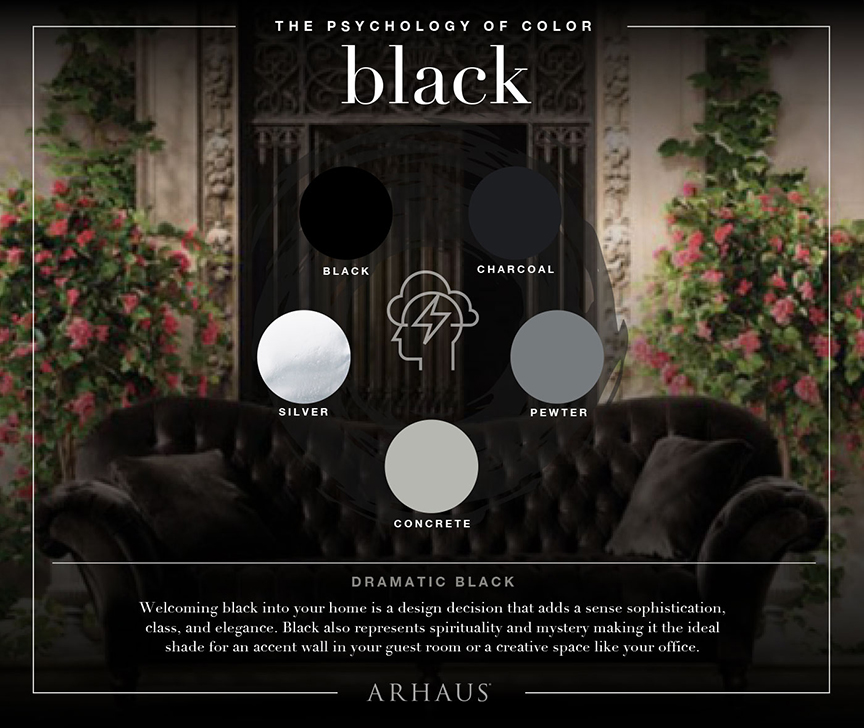
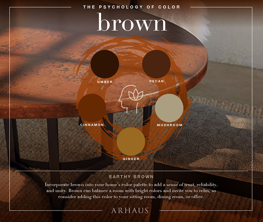
Finishing Touches
Once you’ve got the room essentially put together, with your color scheme well-solidified, it’s time to add the final touches and make it truly your own space. An excellent way to add a personalized element to your home is through old family heirlooms. Now, we’re not talking your grandmother’s prized Waterford crystal china, but an old quilt she made years ago can add a cool, retro feel to a room – while simultaneously honoring your family and heritage.
The same sentiment rings true for artwork, such as paintings or sculptures. A fine piece of art can add an element of sophistication and elegance to any room, but try to avoid heavy contrast between your room’s color scheme and the paintings! Once you’ve personalized your space and implemented colors you love, you will be ready to enjoy it for years to come.
Imagery courtesy Arhaus.
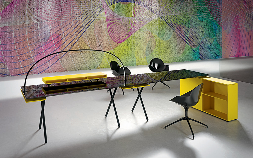
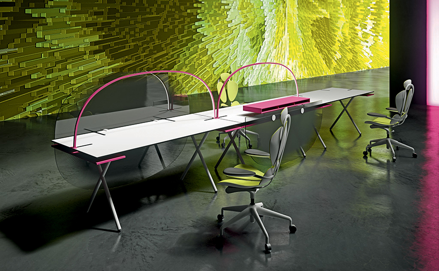
A new line of pop art furniture will brighten your office space.
A result of the extravagant, colorful and recognizable signature of designer Karim Rashid, Hook is the newest collection of modular furnishings by Newform Ufficio designed to instill positivity in the workplace.
“The office space should be comfortable and give inspiration like home, only with less distraction,” says Rashid. “An office should give a sense of freedom, personalization and sharing at the same time.” To reflect these ideals, Rashid’s collection incorporates touches of color, pop art work and simple divisions that create a private environment in line with the parameters of the common work space, making small workrooms obsolete.
The desks are the nerve center of the collection around which all the elements are developed. Each desk can be customized in terms of finishes and colors, and can also include a second, entire or shelf-sized top to store files, small books and/or hide cables. Under the worktop it is possible to insert a second, entire or shelf-sized top, to place diaries, documents or files, but the space also useful for managing and hiding cables. There are also drawers, special modules to insert hard drives, shelf systems and small load bearing shelves to replace thin metal legs. To free the tables from any unnecessary clutter, Rashid and Newform Ufficio have created LED lamps that spread a pleasant ambient light of the entire length of the desk.
To create workstations made up of several desks, a series of translucent screens and side panels allow both privacy and collaboration, as well as open up the space between workspaces. “I believe that the fluid, clean and bright spaces promote an active working life and that an office of this kind will lead to a better and more gritty work in return. My collection for Newform Ufficio embodies this spirit,” Rashid adds.
“Design has been the cultural shaper of our world from the start,” he notes. “We have designed systems, cities and commodities…. Now design is not about solving problems, but about a rigorous beautification of our built environments. Design is about the betterment of our lives poetically, aesthetically, experientially, sensorially, and emotionally.”
All photos courtesy Newform Ufficio.
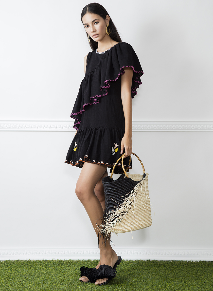
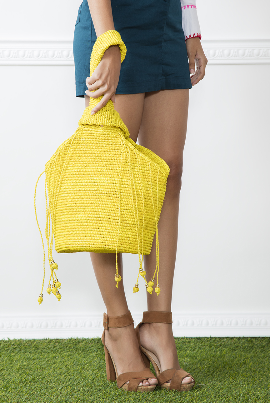
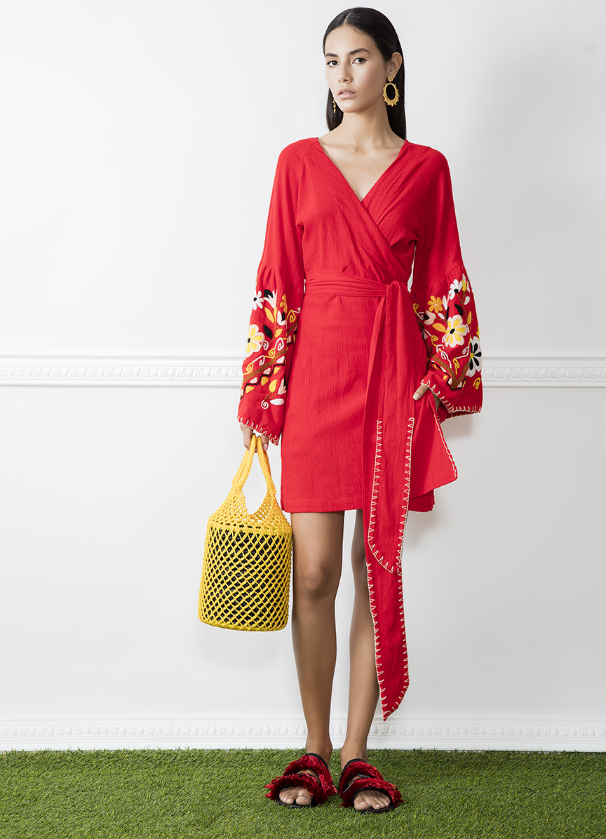
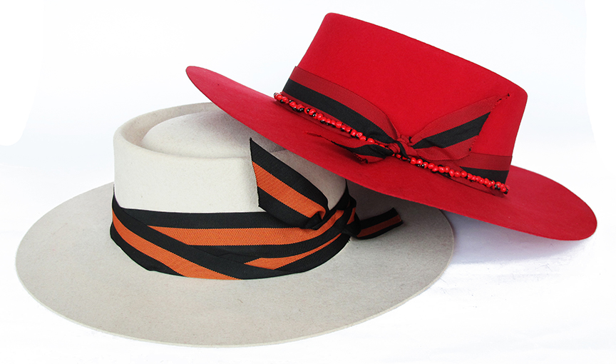
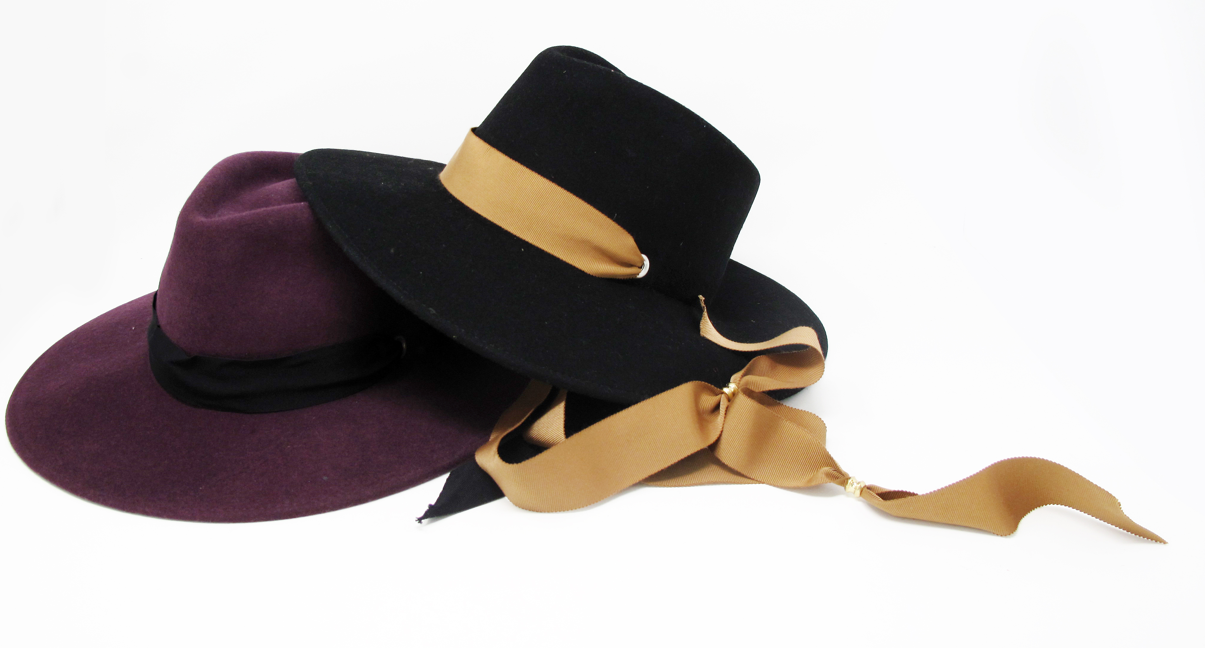
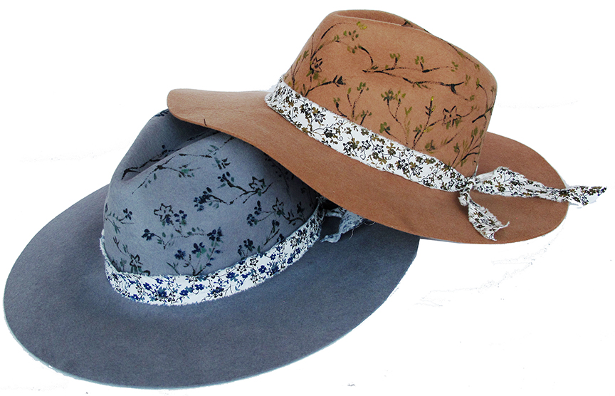
Originally launched in 2010 as a designer and product lab, Ecuadorian design brand Sensi Studio is known for crossing into bolder territories when it comes to fashion. The brand’s use of color and intricate, artisanal products from its summer and fall collections are making statements within the industry, all by the innovative thinking of owner and designer Stephany Sensi.
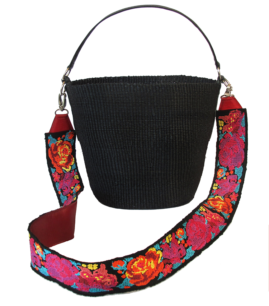
Sensi, who studied Fashion Design at Istituto Marangoni in Milan, takes much inspiration from her surroundings. Many designed pieces showcase a deep appreciation for Ecuadorian artistry and the natural landscapes of Massai Mara in Africa, blending the tribal aesthetic with the brand’s South American vibe. The studio’s upcoming collection highlights both warm and cool tones for the summer and fall, offering a more natural, down-to-earth approach. “We always take inspiration from nature and the colors that surround us here in the Andes region where we produce,” says Sensi. These sparks of creativity from the Andes are demonstrated through the mixture of strong color palettes and softer, feminine tones.
The studio also consistently works with local artisans to learn more about the surrounding natural landscape and new techniques to develop more unique designs in all of its handmade products. “My goal is to stay true to our identity and DNA while being current, fresh, and innovative,” Sensi affirms. These efforts have not only helped women in Andean communities claim job independence, but have have instilled a sense of social responsibility that has spread to 15 countries. Sensi Studio offers artisanal concepts through a current approach to entice fashion-savy clientele.