

Slanted ceilings have made their way outside of the attic, now in living, dining and bedrooms. Designing under these slopes can be tricky, but there are ways to get around it — and even use them to make the room more elegant and spacious. Here’s how:
1. Light and Airy
Whenever you’re tight on space, adding a coat of white paint to the ceilings and walls can make all the difference. Not only does it add a simple and natural tone, but it’s malleable to design the room to your style.
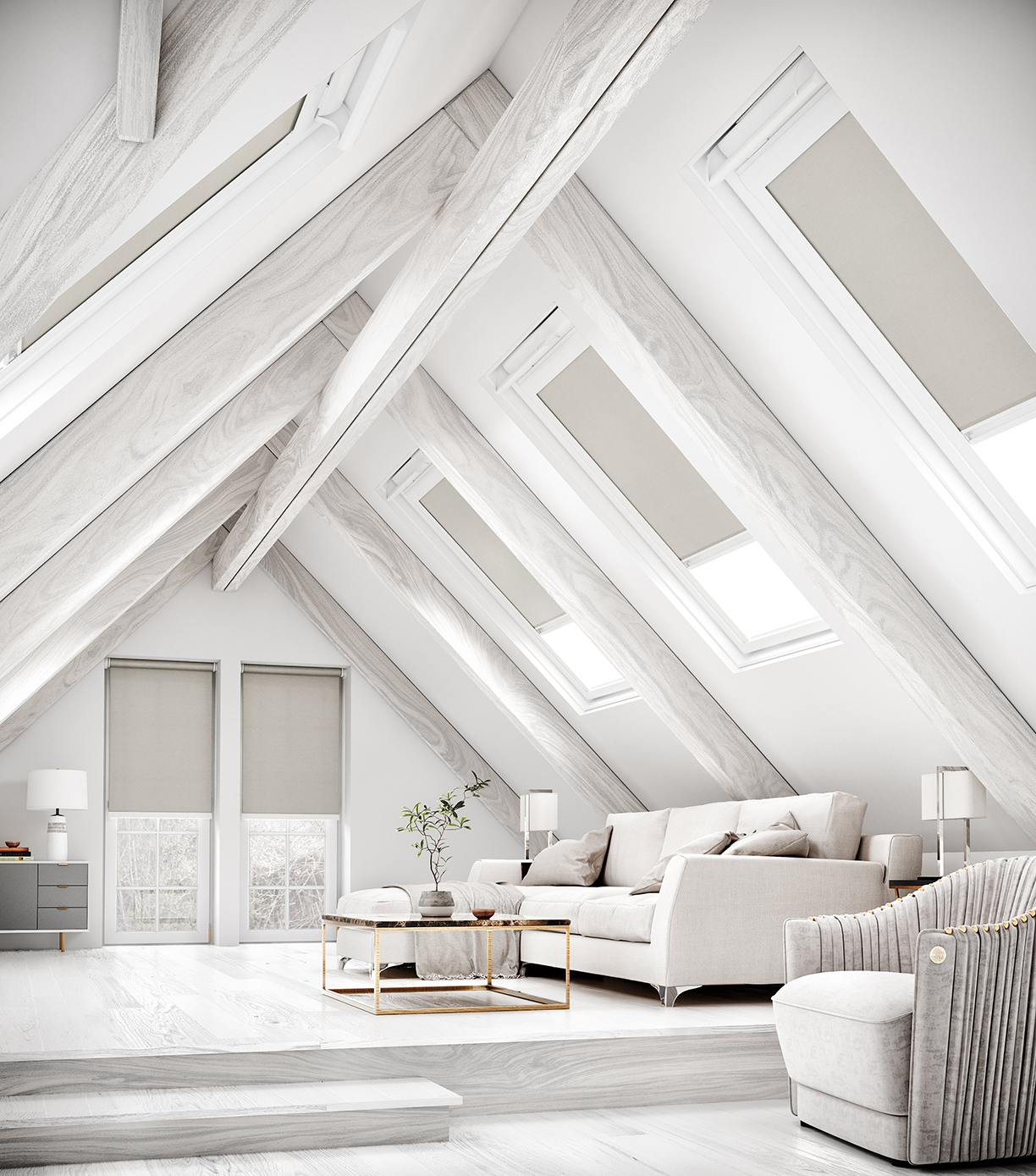
Photo courtesy of English Blinds
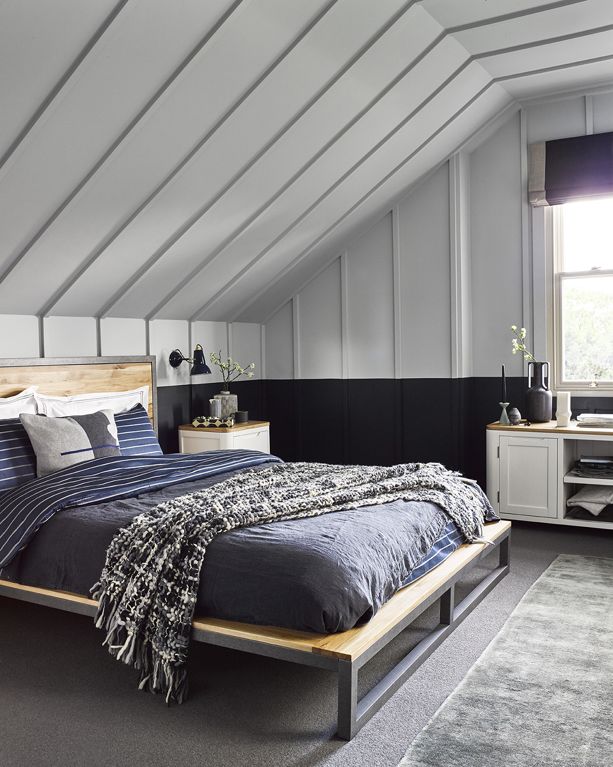
Photo courtesy of Oak Furnitureland
The blank canvas that comes with white walls and ceilings allows for limitless creativity. Create a nautical look for a more relaxed vibe, or add bold colors to make the space stand out. With a white canvas, slanted ceilings can do no harm.
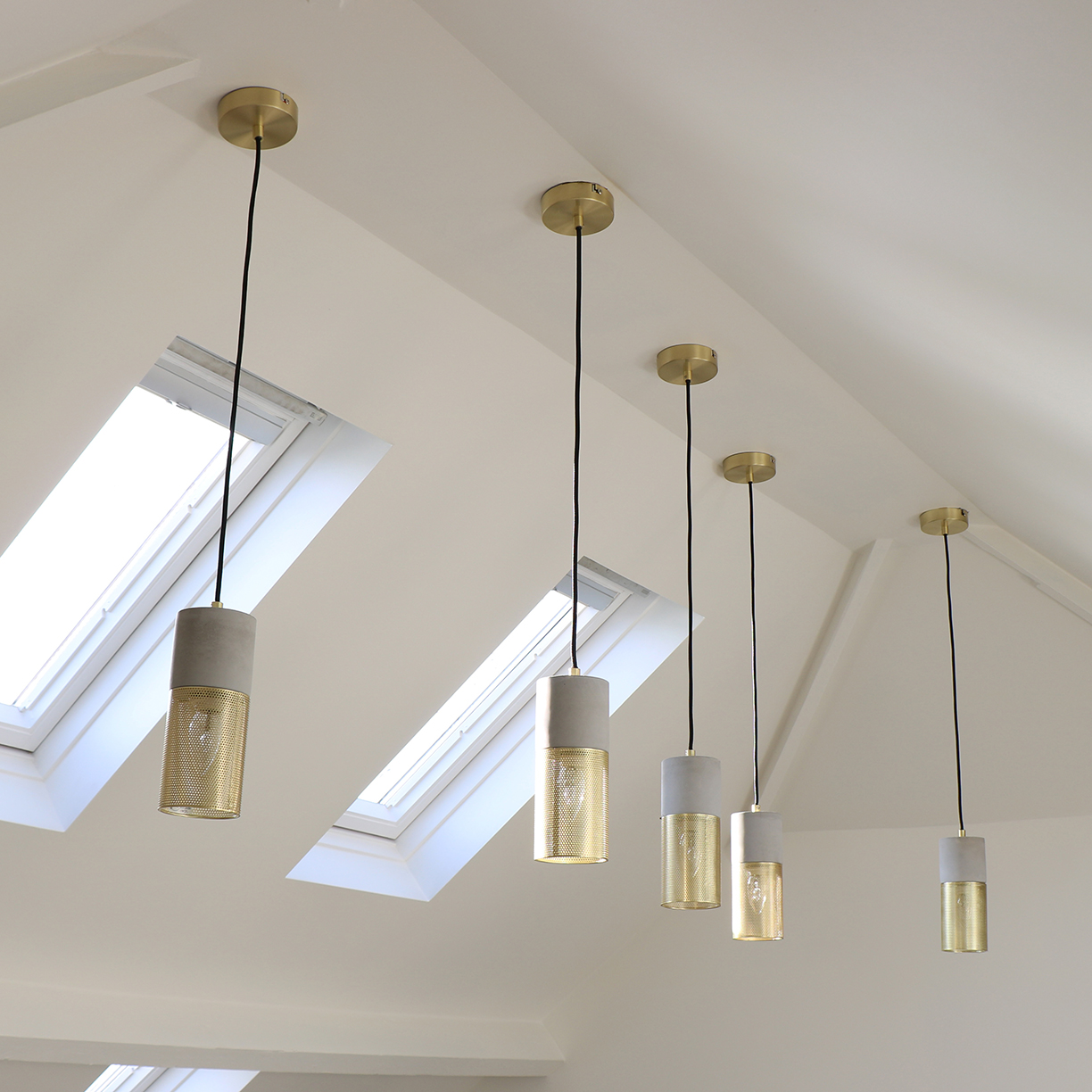
Photo courtesy of Melody Maison
2. Lighting the Room
Lighting a room can be the most difficult challenge when designing a space under slanted ceilings. Many don’t think they can use any overhead lighting, since the ceiling is on a slope. In reality, however, it isn’t impossible — it’s all a matter of picking the right light fixtures.
This is a simple yet elegant style for light fixtures that work perfectly on slanted ceilings. The wires can slightly slightly bend, so that they hang naturally.
Another great way to add natural light under slanted ceilings is with skylights. They flood the room with natural light in the daytime and add a unique and stylish look to the space.
3. A More Natural Look
Sometimes, however, it’s better to let the slanted ceilings add a unique design to the room, rather than hide them with an all-white hue. Adding wooden beams can do just the trick. When the ceilings aren’t too low, wooden beams won’t emphasize the height, but add a beautiful finish to the room instead. Light or dark browns for the wooden beams create a beautiful, natural look that goes with any style.
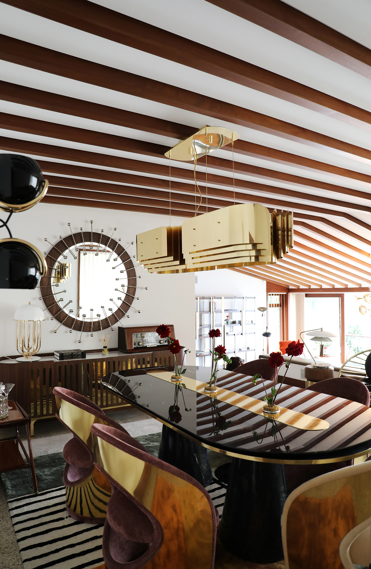
Photo courtesy of Covet Valley
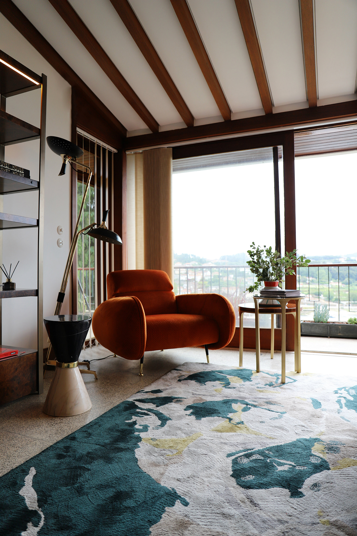
Photo courtesy of Covet Valley
Adding yellow accents to a room can be tricky: while it can transform a dull design to a bright and airy space, anything too harsh can cause the opposite effect. Luckily, there’s a foolproof way to designing a space with the color, and it can be a breath of fresh air whenever you walk into the room.
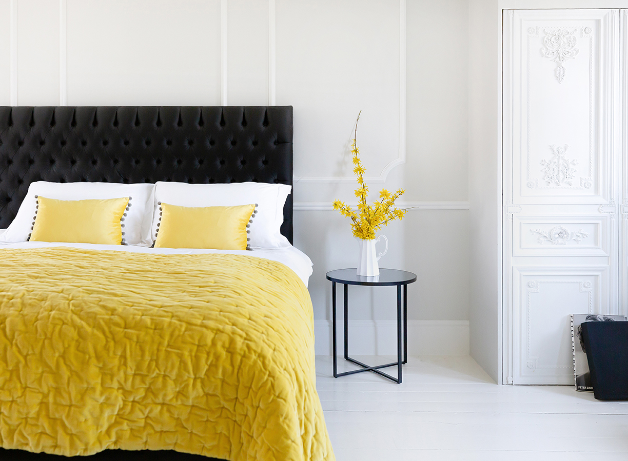
Photo courtesy of The French Bedroom Co.
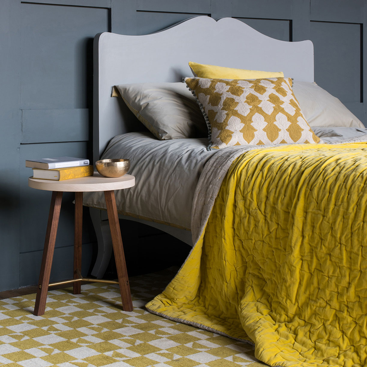
Photo courtesy of The French Bedroom Co.
When it comes to bedrooms, it can be difficult to choose the palette. While yellow walls may be too overbearing, yellow anywhere else may not be enough to do the trick. That’s why these two bedrooms have designed their spaces with two main categories: a bright yellow and a neutral color, such as grey, white or brown. They both balance each other out perfectly, with the yellow still adding that pop without being too harsh. The combination of hues adds to the comfortable and stylish decor, creating a space that’ll both brighten you up in the morning and be a calm retreat at the end of the day.
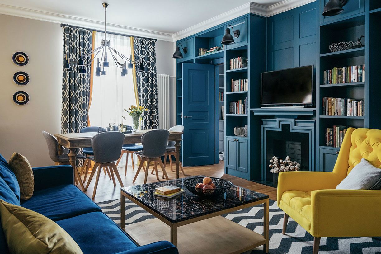
Photo courtesy of DelightFULL
Creating a living room with just a hint of yellow can add the perfect accent. This room that’s almost completely blue has a beautiful addition found with the bright yellow chair. It creates the perfect balance between the colors, creating a space with a unique and alluring charm.
The main trick with designing a room around the color yellow is to pick the right tones. The yellows shouldn’t be too harsh or overbearing, otherwise it will bring an unappealing style to the space. Meanwhile, the main colors of the room should be more neutral yet distinct from the yellow. Clear whites and dark browns and neutral grays play well here.
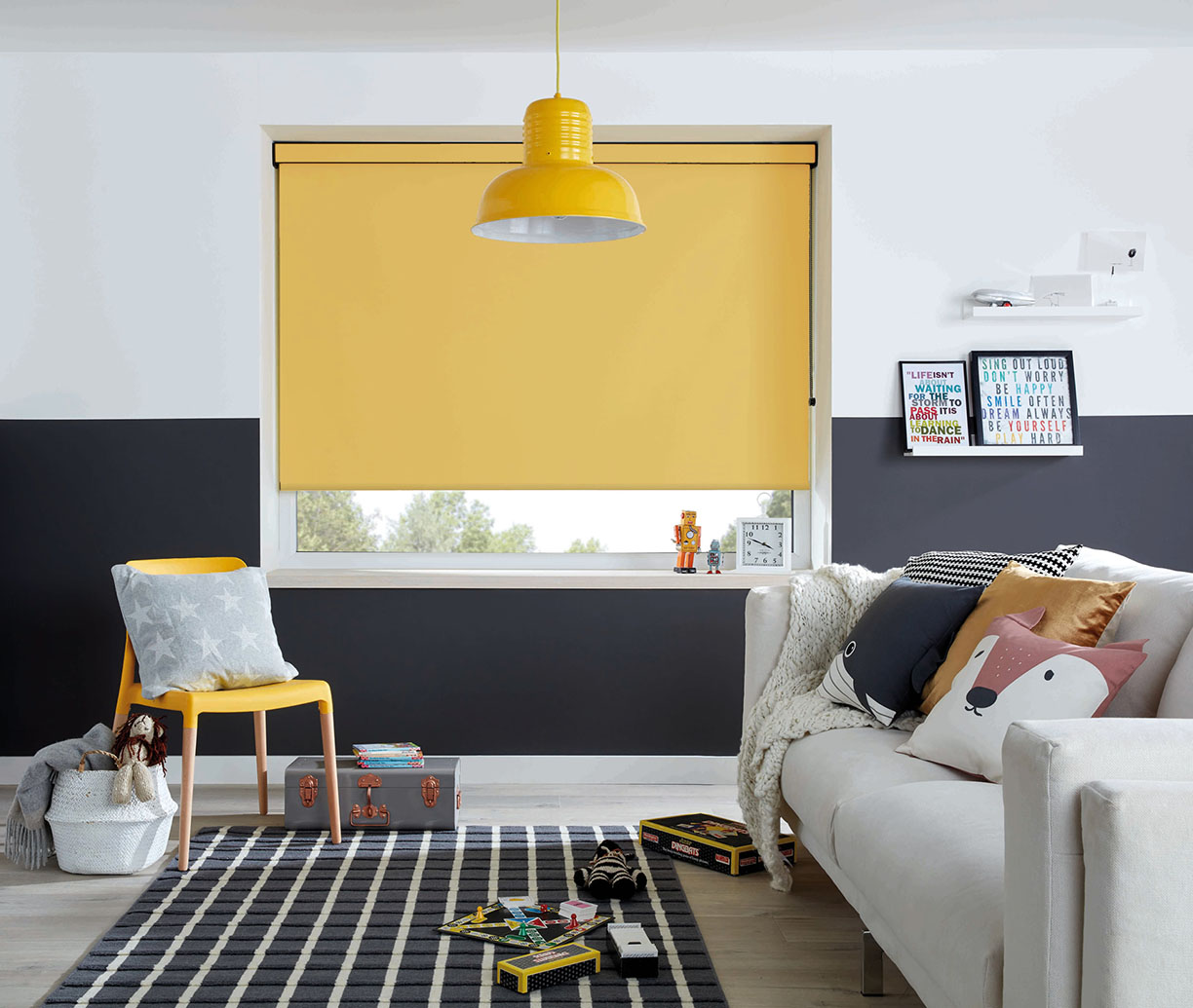
Photo courtesy of English Blinds
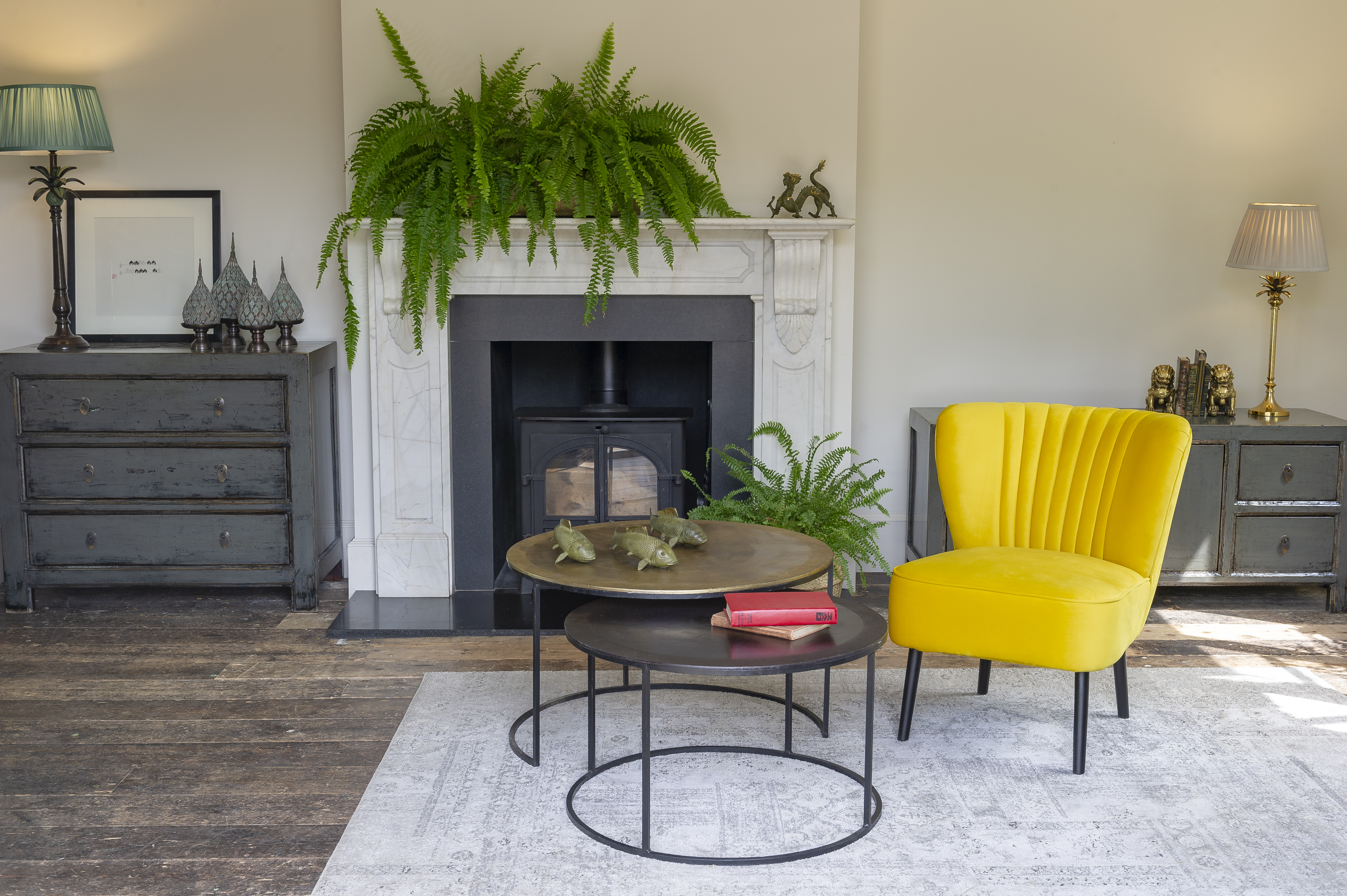
Photo courtesy of Orchid Furniture
Incorporate fresh plants to add another hint of color without making the space look disorganized or messy, and you’re on your way to creating the perfect space that’ll brighten up your day the moment you walk in.
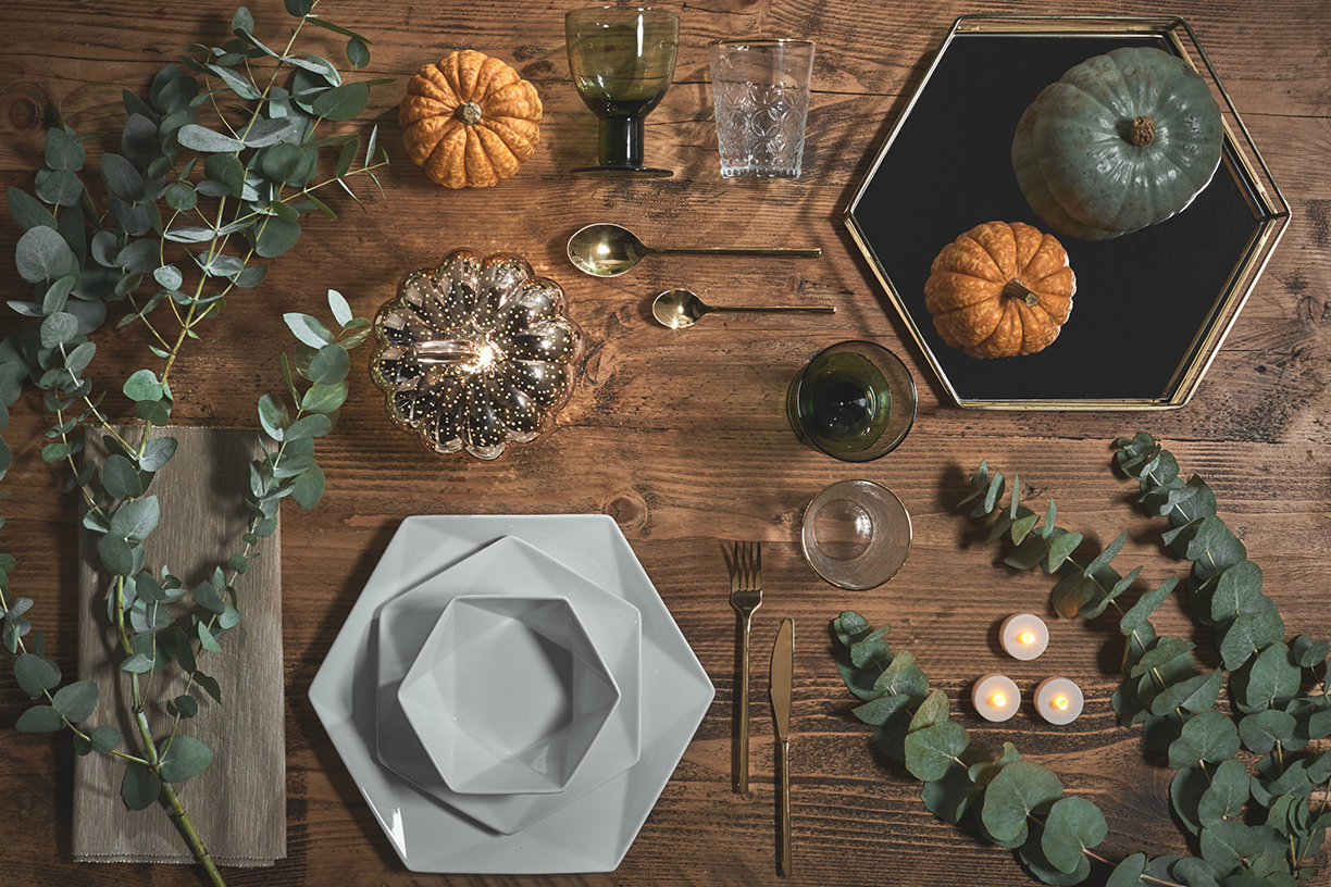
Photo courtesy Lights4fun.
As the summer passes and transitions to fall, there are several ways you can incorporate fun, easy changes to your home style to showcase a sleek, sophisticated style that flows perfectly with the season. Rebecca Snowden, Interior Style Advisor at Furniture Choice Limited, shares three key décor tips to style a cozy home for Autumn 2019.
Jewel Tones and Inviting Textures
This autumn, let rich jewel tones like deep mauve, sapphire blue and dust pink take center stage. “Embrace the sophistication of the season in all its moody glamour,” says Snowden.
A lush black velvet bed instantly adds elegance to a bedroom and sets a luxurious base to build upon. Layer deep, rich tones via opulent textures like velvet and faux fur to create a lavish, comfortable setting.
Light up the space with distinctive fixtures to enhance the overall ambiance. “Individual pendant bulbs give off a modern, almost industrial feel while sleek, standing lamps are practical and stylish,” Snowden notes. Display fresh flowers for a burst of life or dramatic floral artwork with contemporary charm as final touches.
Photo courtesy LUXXU Home.
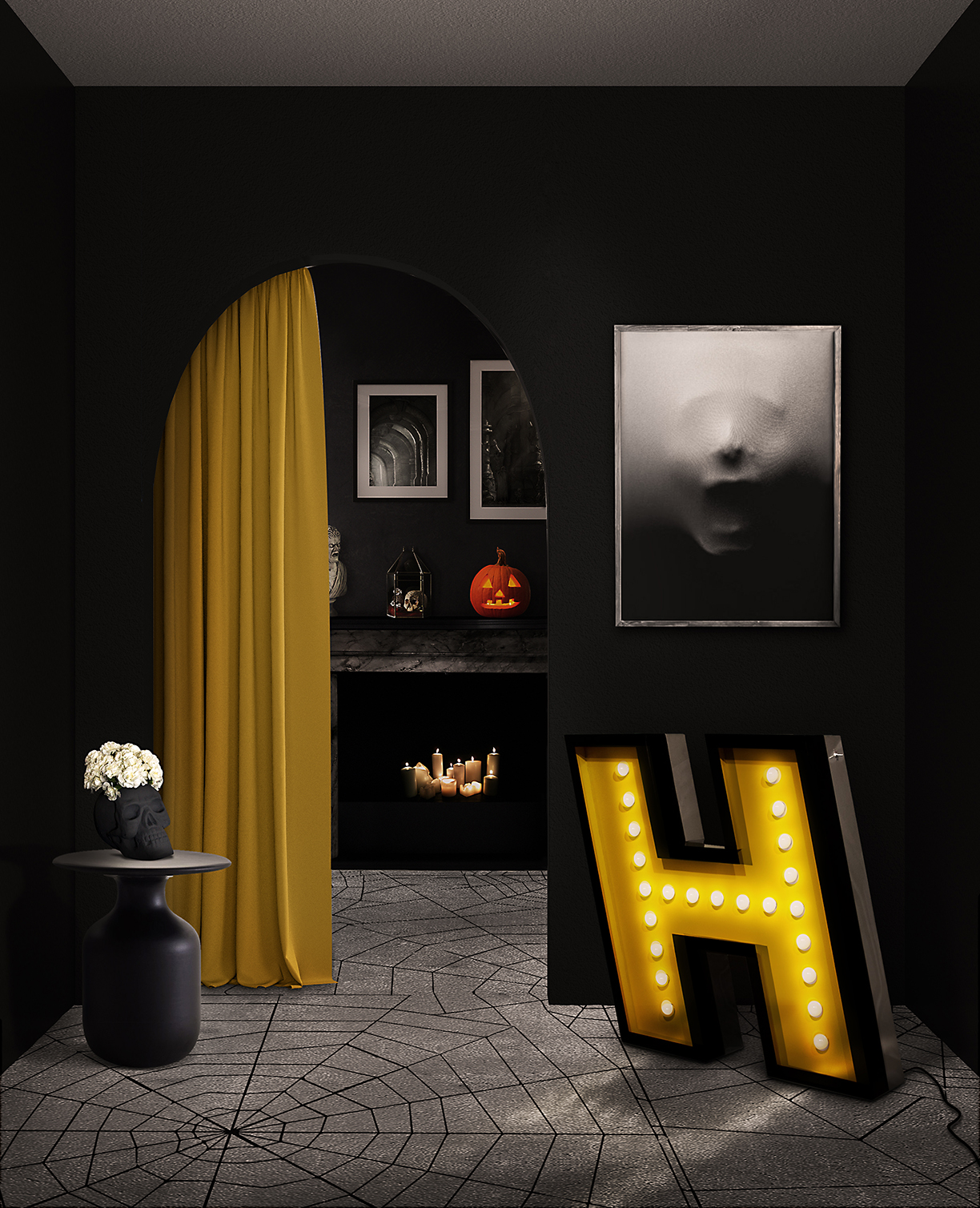
Black and Yellow – A Perfect Pair
On a brighter note, pairing black and yellow results in a lighter, modern take on autumn décor. One part dark, one part festive, and altogether stylish. Choose a dark yellow like mustard, in homage to autumn’s signature leaves.
“This trendy color contrasts nicely with a sleek black leather sofa to produce an edgy and seasonal-appropriate palette,” says Snowden. Go bold with a mustard feature wall or start small with yellow cushions, rugs and planters.
With this style choice, Snowden also recommends keeping the rest of the room simple and opt for pieces with clean lines to prevent overwhelming the senses. Add warmth with a soothing accent color like forest green, achieved through incorporating dark green, leafy plants. These not only bring in life but also a sense of freshness, all while contributing to the overall style.
Photo courtesy DelightFULL.
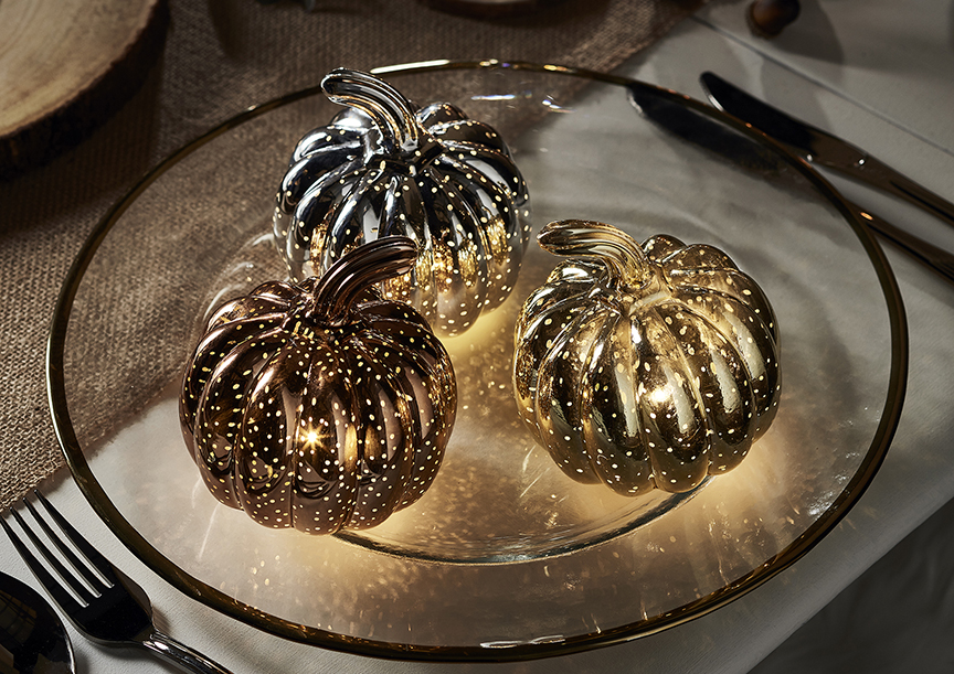
Accessorize
In the spirit of transitioning into the season, get crafty and DIY some autumn-themed accessories. “Metallic accessories are a simple and effective way to add a pinch of glamour and light to any space,” Snowden advises.
Photos courtesy Lights4fun.
When designing a child’s bedroom, the typical idea is to create a space with a bright, happy atmosphere. Finding the line between fun and playful to childish and unfashionable can be a thin one. It’s important to keep this space clean and stylish, without making it too modern or uncomfortable. Here are a few ways to find the perfect balance:
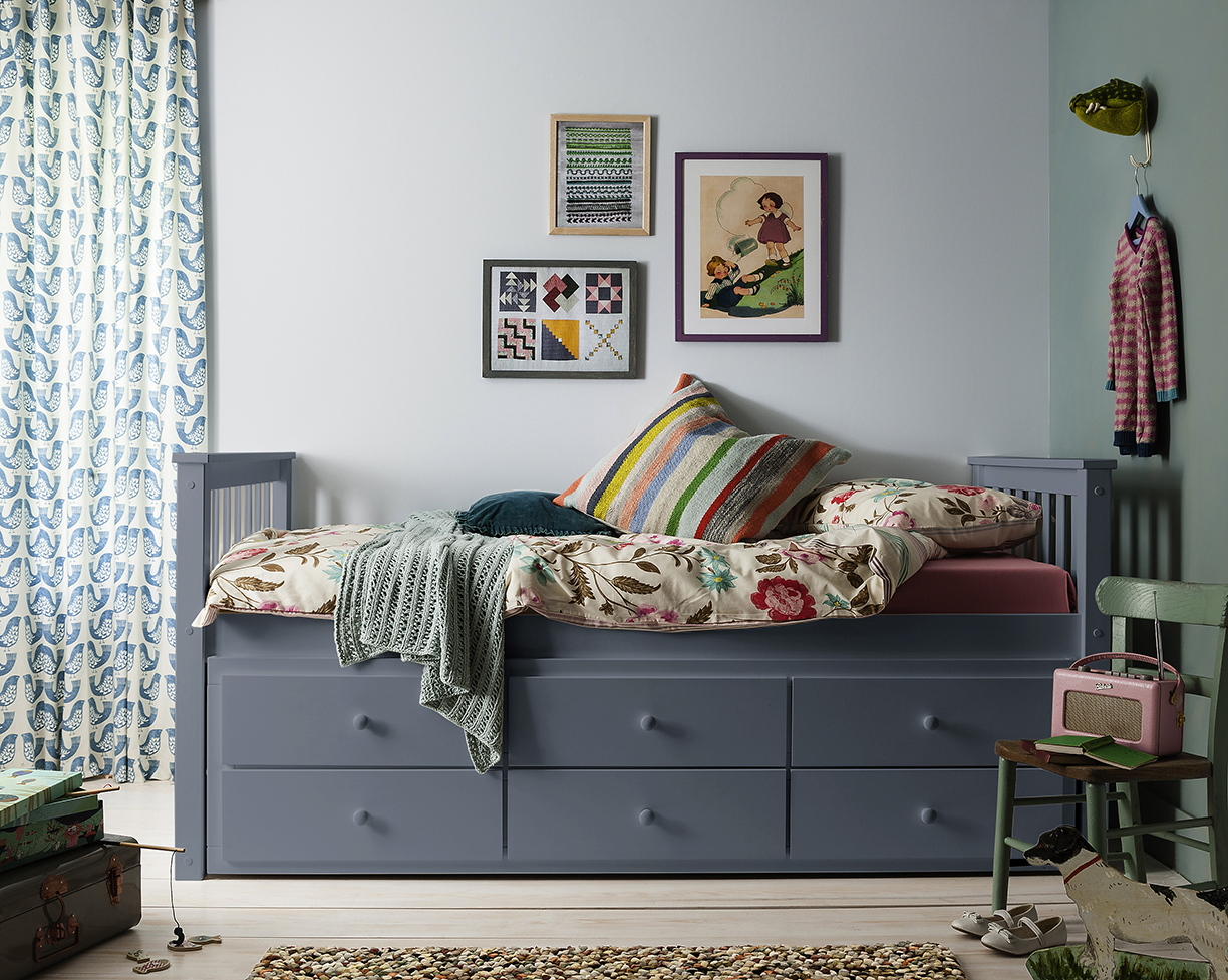
Photo courtesy of Noa and Nani
1. Storage Space
The many toys and games a child has creates the need for just as much storage space to organize it all. To keep the clutter away, choose a bed frame that includes built-in storage underneath. The mess that’s usually found under a child’s bed is now tucked neatly away in drawers, to create a comfortable and relaxed atmosphere.
2. A Colorful Canvas
The key to decorating a child’s bedroom is balancing the tones and color schemes, in order to create a happy childlike atmosphere. Look toward colorful pieces to balance out more subtle tones. This way, the space will look warm and inviting while not feeling cluttered and chaotic. A bright, colorful rug like the one below can add a fun, youthful piece to an otherwise modern room. Shelving is also a great way to add color to a child’s room. While not too overbearing in its appearance, the bright color is a modern and stylish way to keep a kid’s room on trend.

Photo courtesy of Go Modern
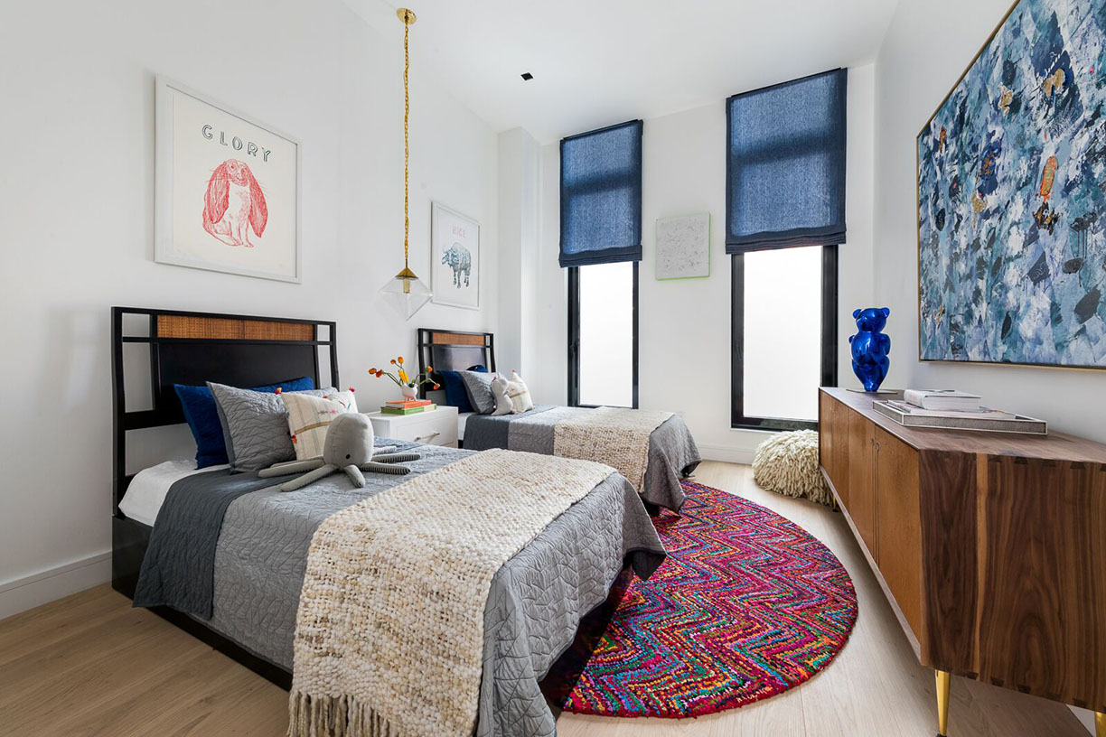
Photo courtesy of 111 Leroy
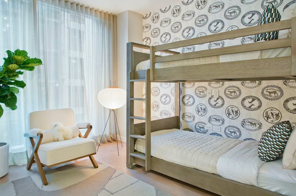
Photo courtesy of The Alyn
3. Balance Between Modern and Warm
Designing a child’s room is also finding a balance between modern and functional while creating a warm and welcoming space. The goal is to avoid scattered and outdated designs. A designer’s trick is to use both warm and colorful tones with function in mind. Deep greens, browns, reds, and blues create a sanctuary that’s both stylish and comfortable. In this bedroom at the Alyn, shown below, a neutral color palette alongside other playful elements to maintain the balance.
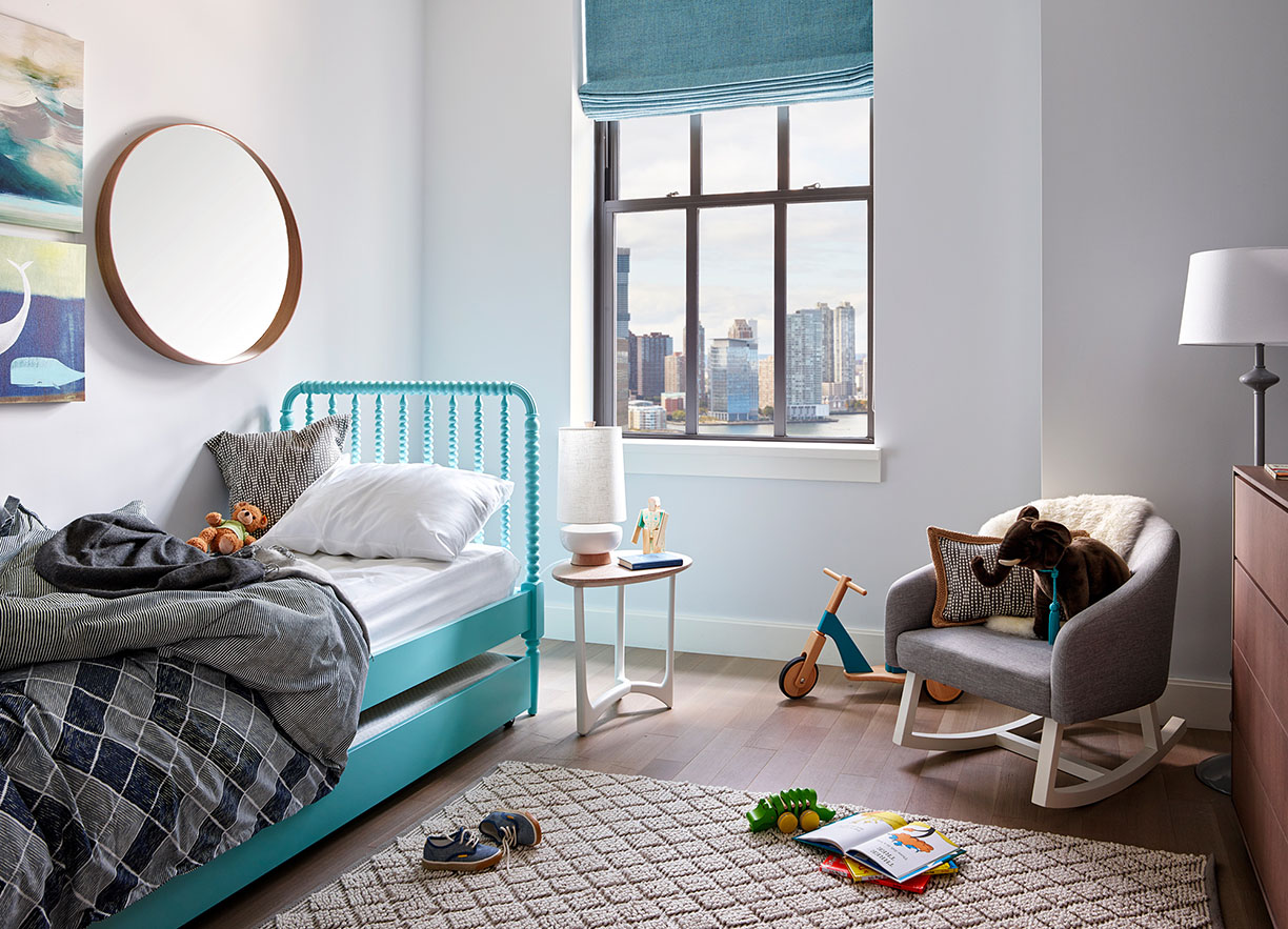
Photo courtesy of 100 Barclay
Over the past few years, stained glass has gone from a dusty antique item in an old home to modern works of art. With the industry making a comeback into the luxury scene, interior designers are challenging themselves to design a space around the ornate glass. Here are a few different ideas:
Photo courtesy of Bespoke Glass
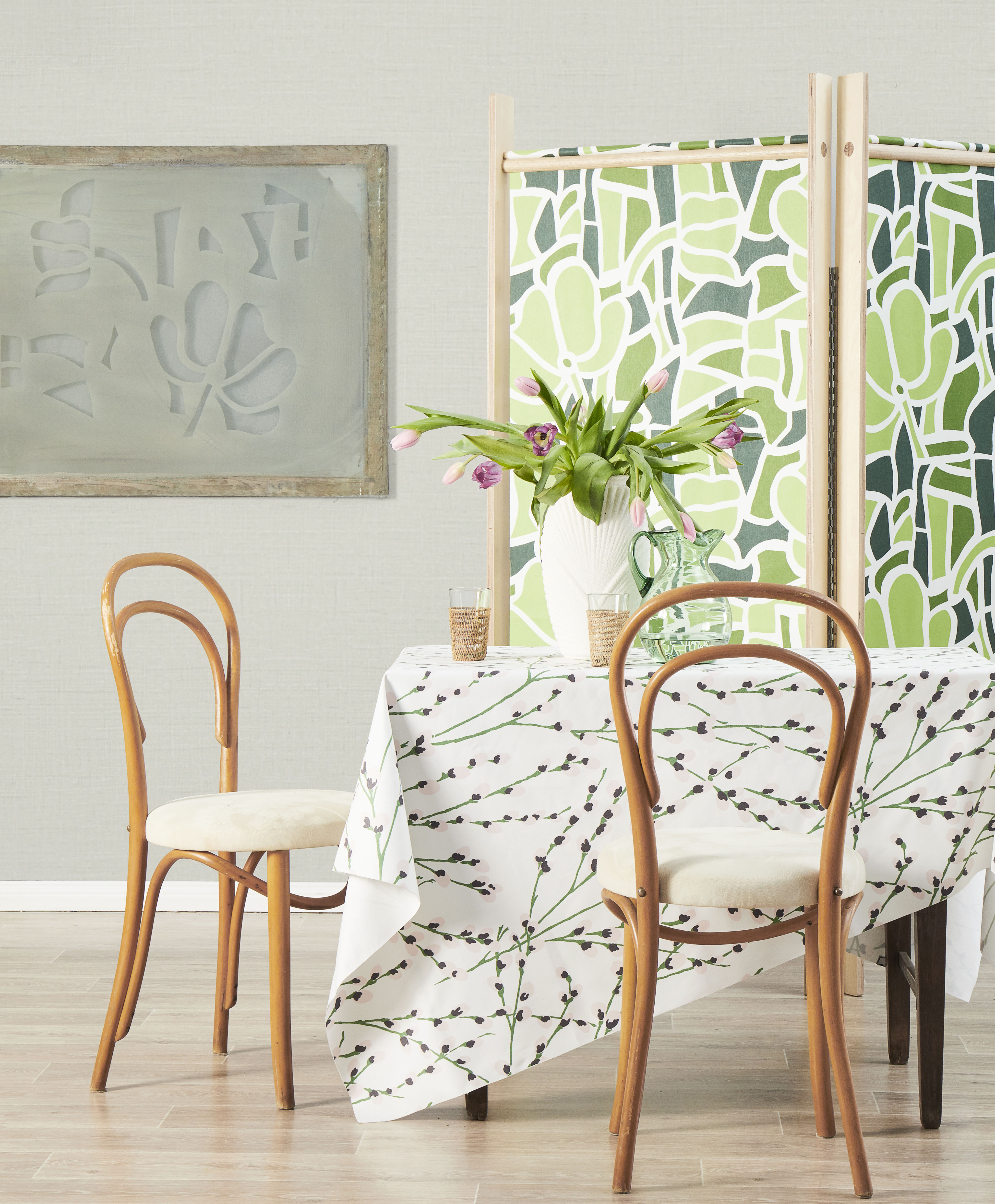
Photo courtesy of Florence Broadhurst Fabrics
Stained glass can add a pop of color and make your space feel both cozy and modern. The green colors on this partition add a bright finish to the room, making it the centerpiece for all the other furniture to gather around it. While still looking modern, it brings back an old-school style to provide a sense of comfort as well. Nowadays, adding a piece of stained glass to a home brings a unique style unlike any other — one that brings you back in time, while also staying ahead of the times, too.
Located in New Haven, Connecticut, the Blake Hotel adds a unique style to the space by featuring the work of Bespoke Glass, a studio-based business in Brooklyn, New York. The different shades of blue colors and the glimmer of the glass adding a retro look that transports you to a different time in the past, while also staying current and on-trend. The placement of the blue pieces adds an edgy and one-of-a-kind appearance. Not only is it a partition, but it’s a work of art in its own right.
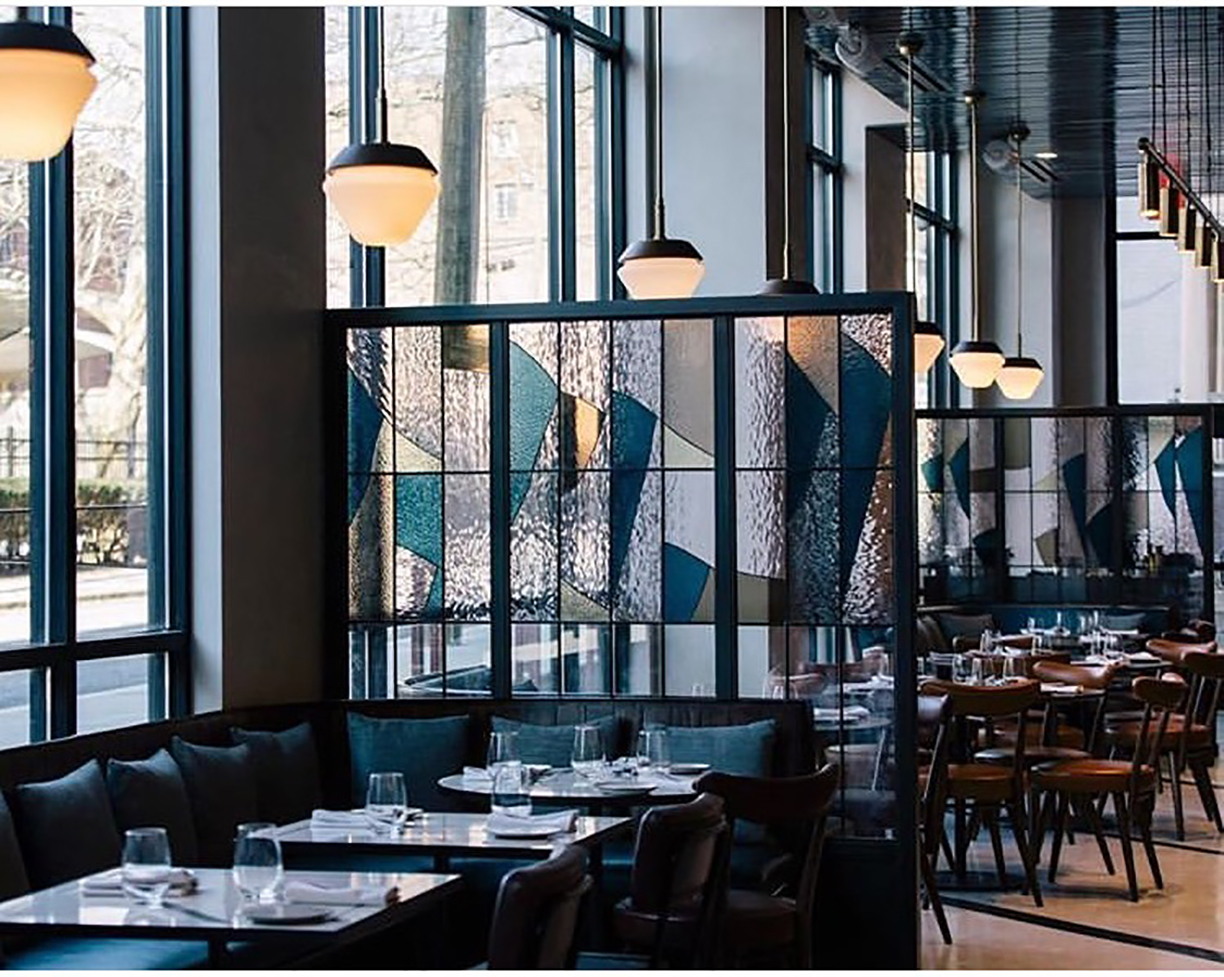
Photo courtesy of Reed McKendree
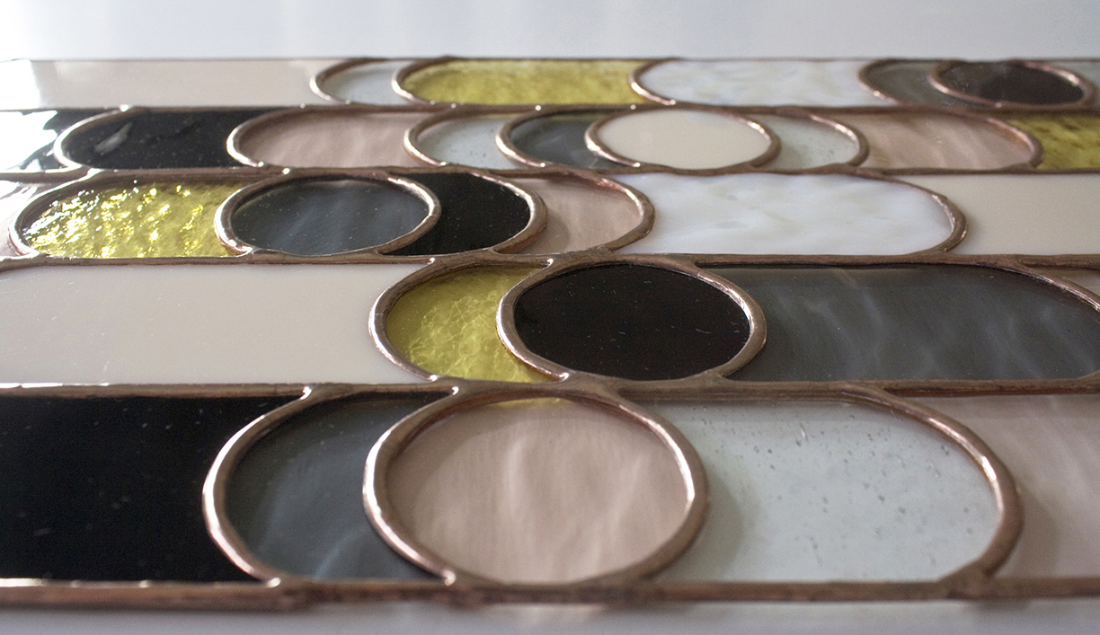
Photo courtesy of Bespoke Glass
By changing the designs stained glass was normally confined to in the past, studios and interior designers around the globe are beginning to take out the dusty antiques from their storage bins and create works of art instead. With so many different styles and colors, the possibilities are endless.
After designing the pieces Let it Be and Come Together in 2017 and 2018, designers Ludovica and Roberta Palomba at Poltrona Frau have fortified their third installment that further pays homage to the Beatles. Get Back and the other two pieces inspired by the musical legends are welcoming, tailor-made pieces that offer a return to comfortable spaces, where one can really feel at home.
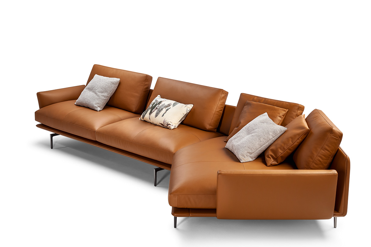
Get Back
Inspired by the refrain, “Get back, get back, get back to where you once belonged,” the Get Back sofa was designed a product of “in-depth research into comfort,” according to the brand when the piece was introduced at this year’s Salone del Mobile.
With generous, spacious and open lines, reclined backrests that encourage relaxation, and numerous modular elements to combine freely in lots of different compositions, it’s difficult not to find a sense of inner peace when sitting on this sofa.
On top, soft cushions and chaise elements offer unexpected depth, as well as an alluring invitation to “Get back home” and enjoy the relaxing and convivial atmosphere of your living room.
Let it Be
Rejecting convention and formalism, Let it Be was the first of the Beatles-inspired modular furniture systems designed by Ludovica and Roberto Palomba for Poltrona Frau.
Channelling the popular Beatles song, this seating solution embraces and reinterprets the notion of the Roman triclinium where individuals lay down, ate, talked and lazed about in earlier times.
As a refuge for relaxation, the sofa’s infinite configurations afford individuals the opportunity to curate different arrangements to fit their space and lifestyle.
The purity of the design is accentuated with beautiful details including leather and saddle leather stitching as well as refined plush cushions.
Come Together
Keeping comfort and sociability in mind throughout the creative process, Come Together was born out of a desire to offer people a place for sharing — even moreso, an invitation to rediscover the dimension of physical and concrete proximity of exchanging ideas and emotions.
Each facet of the design encourages people to come together and enjoy the company of others. With limitless compositional possibilities, this system features a series of accessories that are versatile and functional.
Differing elements were designed to connect seating compositions to ultimately create more livable, shareable and convenient arrangements.
All photos courtesy Poltrona Frau.
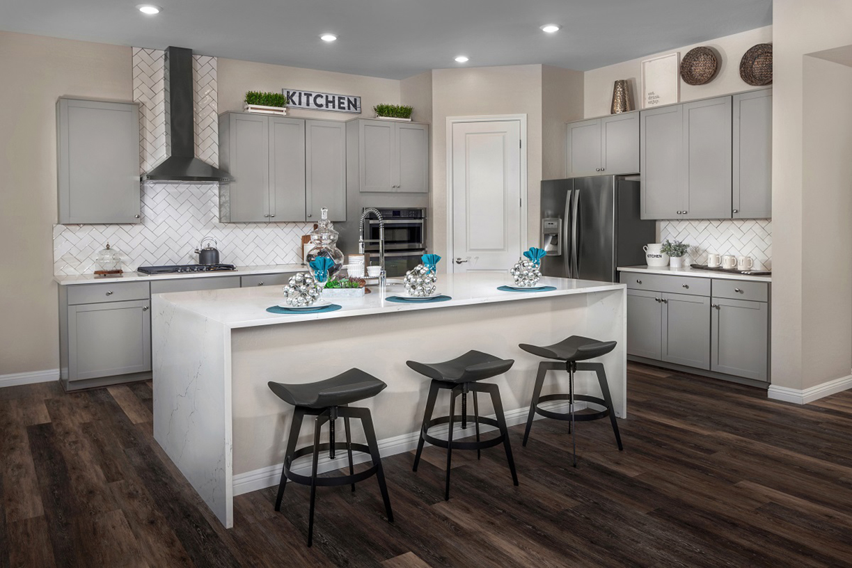
KB Home Design Studio is known for working with customers as they are building a new home to help them personalize the space for their individual needs.
“Because each customer is unique with different tastes, we must be able to include choices that reflect many design aesthetics,” says Gena Kirk, Vice President of Design at KB Home.
This method comes readily at hand with a market that is continually evolving, with millennials currently making up the largest share of homebuyers in today’s market. We spoke with Kirk to learn more about how designers and brands like KB Home are staying on the pulse of emerging design trends and what millennials are really desiring in their homes.
What tools outside of work help inspire you while you work?
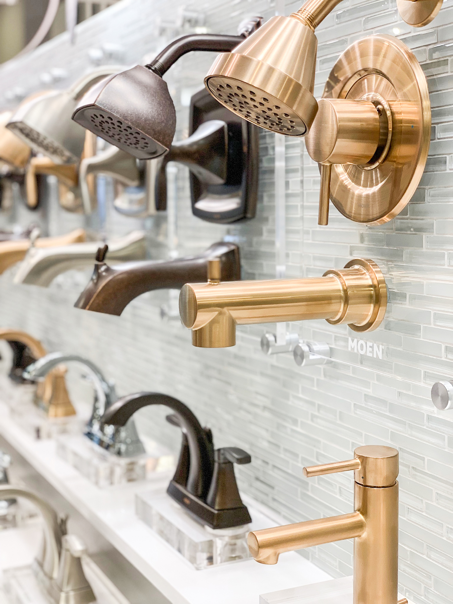
These are some of the mediums that aid me in selecting the best choices for our KB Home Design Studio customer. In addition to the usual interior design outlets that inspire me, I am also inspired by our supplier partner’s innovative products and consumer research such as Moen’s Magnetix Handheld Shower and Shaw’s Luxury Vinyl Plank flooring.
We’re accommodating a wide variety of customers who are looking to personalize their home at an affordable price so the more information we have about the products being developed and available the better we can provide value products to our KB customer.

Gena Kirk, Vice President of Design
KB Home
Are there some that don’t inspire but help you get away from work?
I am personally inspired by such mediums as home design shows, decorating magazines, Houzz, Pinterest, Apartment Therapy, decorating blogs and following retail furniture trends.
What kind of styles/trends are most prevalent in millennial-bought homes today, and why?
In millennial-built homes, we’re seeing from the KB Home Design studio a few things. For example, they’re prioritizing things such as flexible spaces within the home, an eye towards health and wellness, an interest in technology and a minimalist design. KB Home tracks these interests to make sure we’re offering our millennial buyer what they’re expecting and what they want to make their homes their own.
Millennials are purchasing only the square footage they need verses the biggest home they can afford. This makes flexible spaces very important to these buyers and they want to make best use of that space.
Millennials also have an interest in the home as a source of health and wellness. They have an interest in things like door fixtures that are antibacterial, or no-touch have become popular, as well as Energy Star HVAC that helps not only cut down on utility costs, but also provides clean indoor air.
Lastly, millennials are looking to a minimalist design aesthetic. This also helps maximize their living space and provide a clean, modern look. They will use neutral paint colors, like greige, to warm the space.
What has been your favorite project to work on at KB Home?
My favorite and most rewarding project to work on was designing, creating and building the new KB Design Studio. KB Home was able to highlight our personalization options in beautiful design studios across the company. Our suppliers have their product on display and are uniquely merchandised to promote customer interaction and product sales. Additionally, our customers love the interactive displays and organized choice making the selection process easy and fun!
Was there anything that inspired you specifically?
Designing the KB Home Studio was more challenging than designing a room. I considered the warm and welcoming feeling that I wanted the space to convey, as well as the idea that the KB Home studio needed to inspire our customers and provide them with a creative space to fully personalize and envision their new home.

KB Home Studio. All photos courtesy KB Home.
While dark-colored walls can add a depth to a room, it can sometimes be tricky to style around them. Every dark-colored wall brings a heavy tone with it, and it’s important to know how to design the space so has a balanced tone. While it’s a designer’s challenge, here are different rooms that prove it can be done:
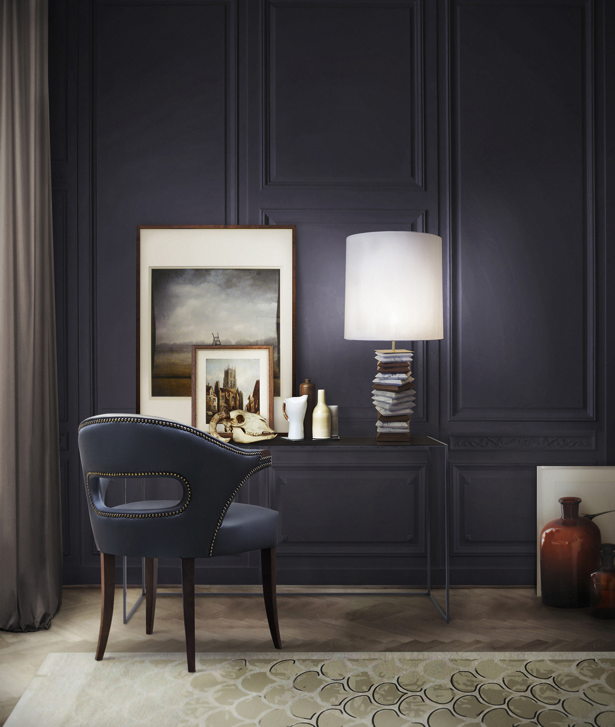
Photo courtesy of Brabbu Design Forces
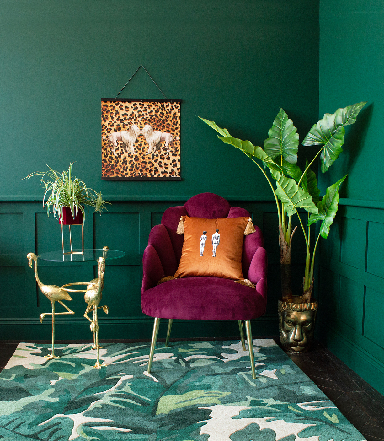
Photo courtesy of AUDENZA
1. Brighter Colors, Warmer Tones
When designing any room, it’s crucial to look at the colors you’ll be using and make sure they balance each other out. This is especially so for rooms with dark-colored walls. While they add a great tone to the space, too many darker tones can make a room feel cold and uninviting.
The perfect balance of colors involves a mixture of both darker and lighter colors, such as this bright red chair in front of a dark green backdrop. The chair adds a pop of color, making the dark colored walls feel warm and inviting.
1. Light versus Dark
Balancing the lighter and darker tones can be a challenge, since having too much of one can overwhelm and wash out the other. These baths represent the perfect balance of tones. The darker walls counteract against the polished bathtubs and light fixtures. This not only adds a great balance, but brings a rich and inviting depth of color to the room.
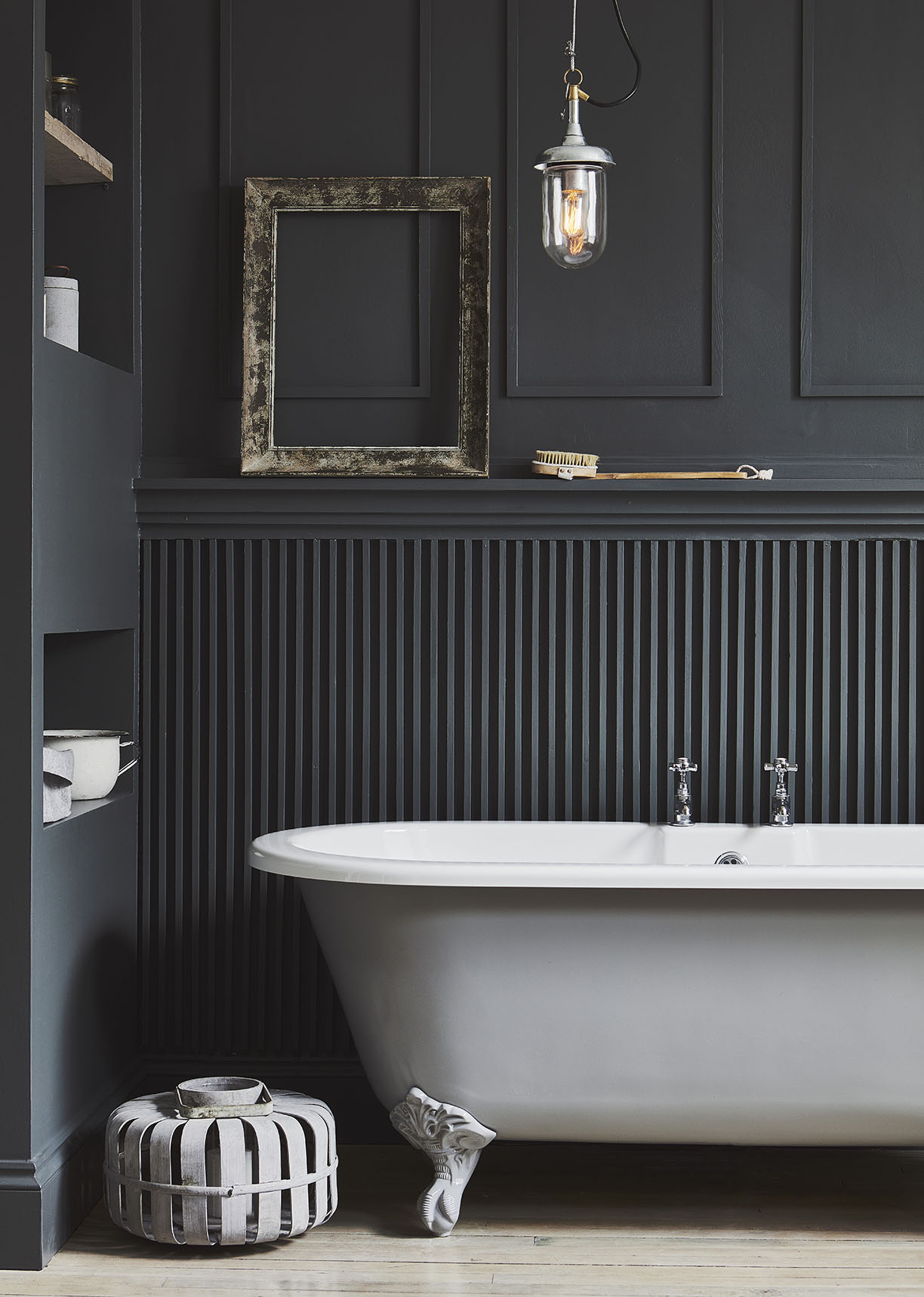
Photo courtesy of Garden Trading
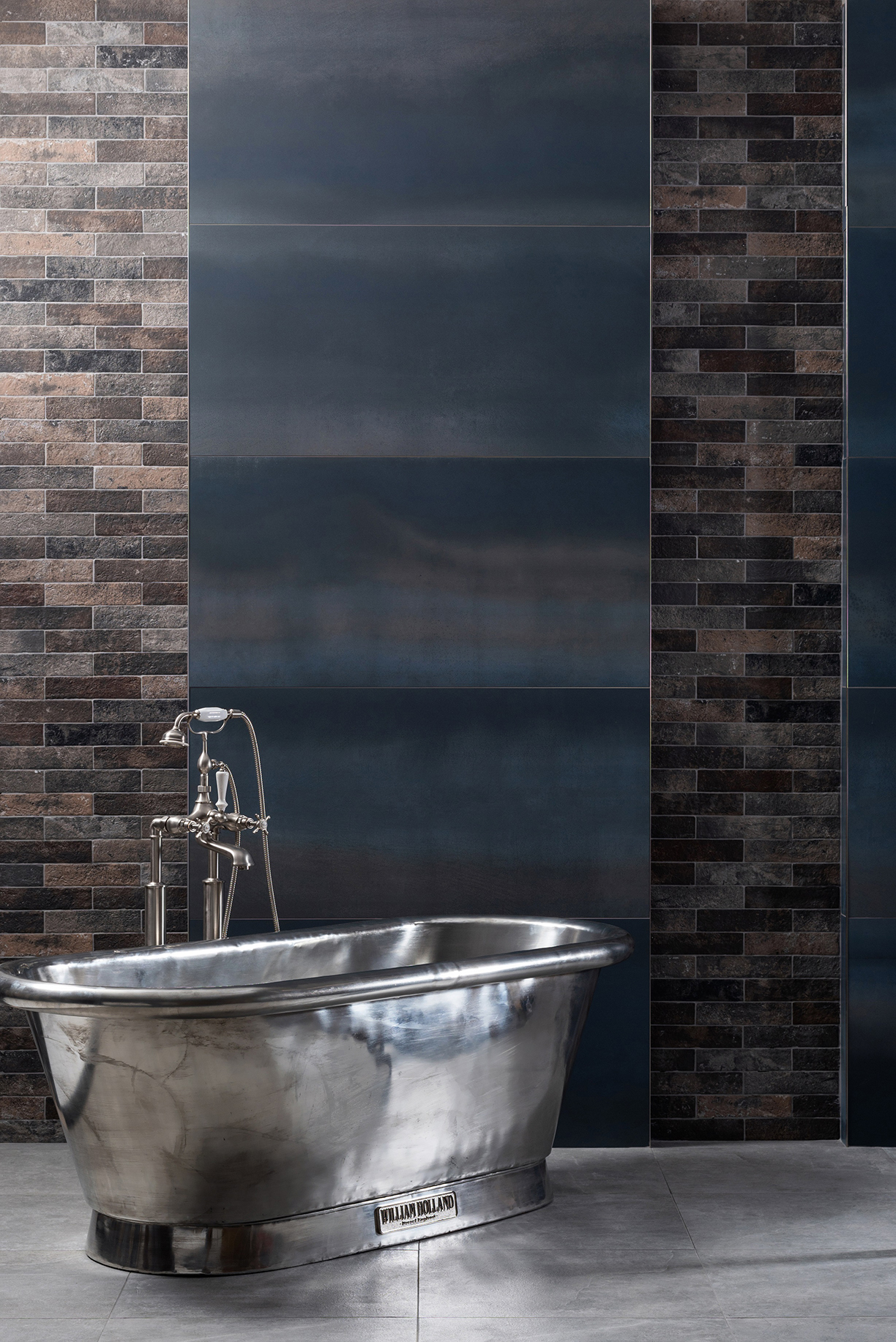
Photo courtesy of Original Style
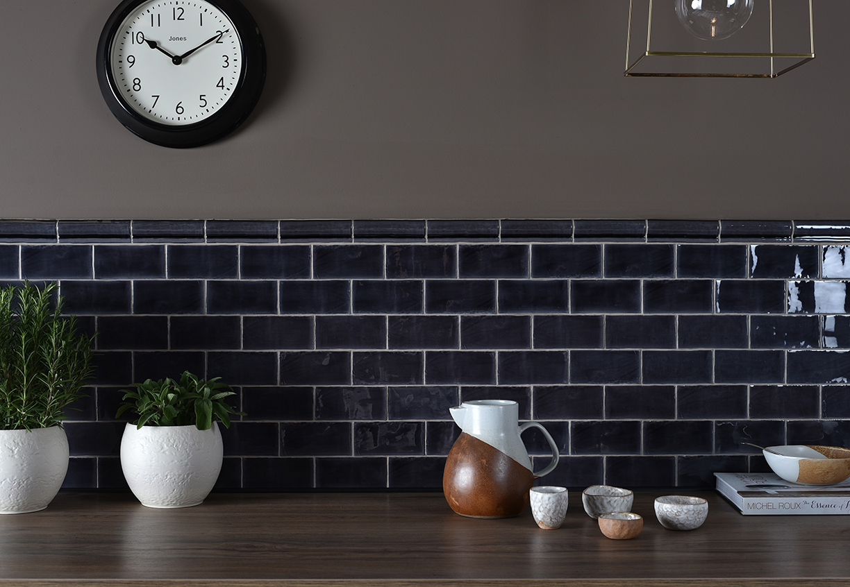
Photo courtesy of Original Style
3. Allowing Tones to Stand Out
When it comes to dark-colored walls, an immediate response may be to counteract the heavier tones with lighter statement pieces. While this can create a beautiful design, it’s important to allow the rich, dark colors to stand out. In this kitchen, there are minimal pieces that are lighter in color, allowing the walls to be full in color and provide a warm and cozy atmosphere.
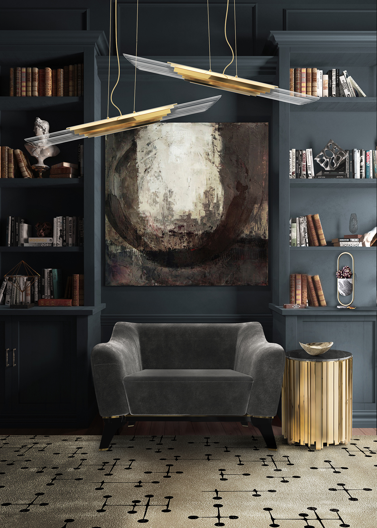
With the push for wellness-oriented spaces around the globe, interior designers are looking for different ways to incorporate this rapidly-growing industry to their styles. While including more plants and flowers into the home is known to brighten up the atmosphere, some designers are taking this theme to the next level. Here’s how:
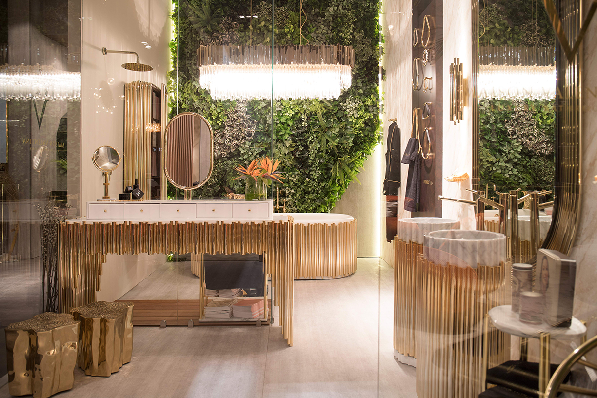
Photo courtesy of Maison Valentina
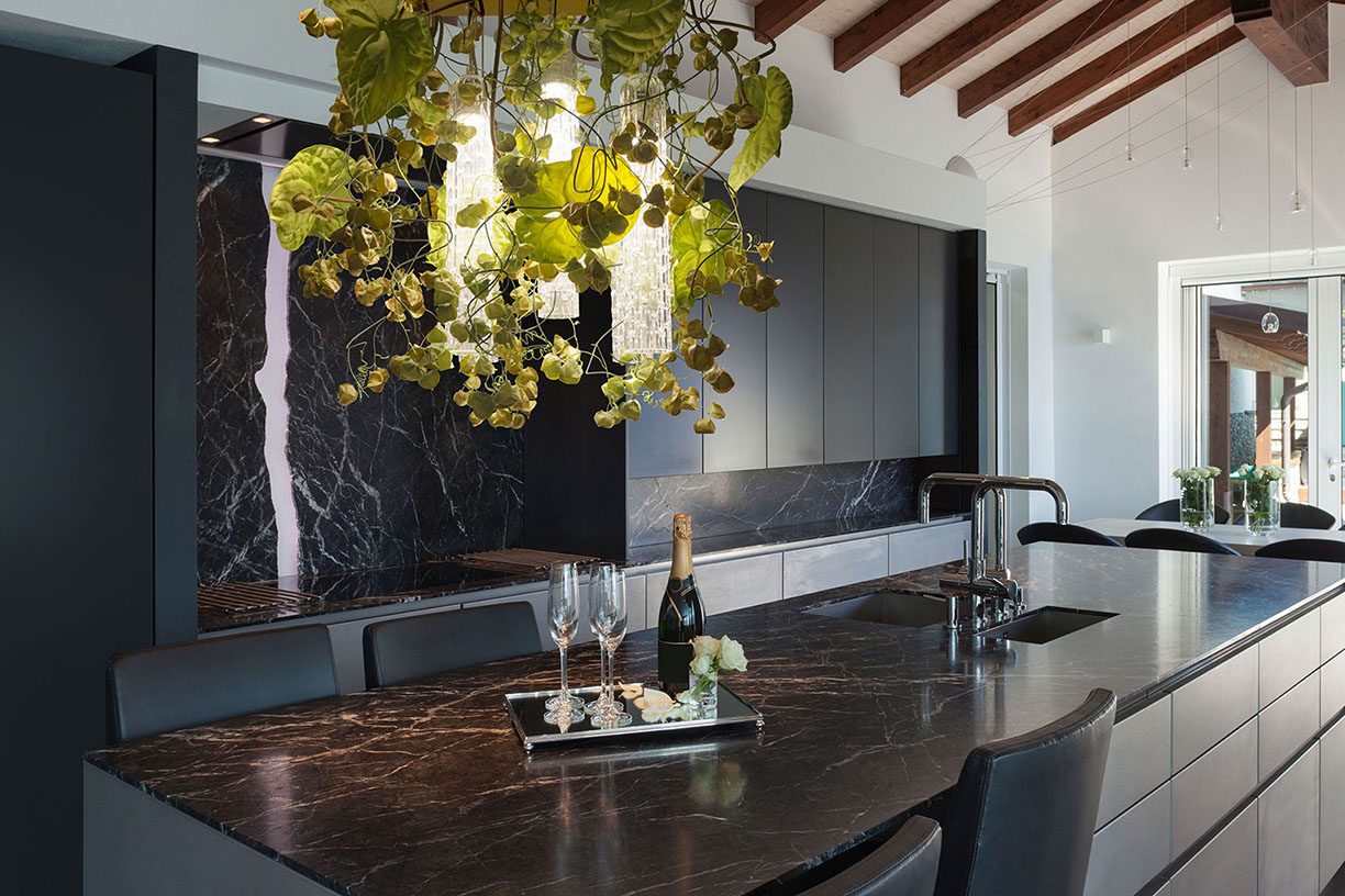
Photo courtesy of VG New Trend
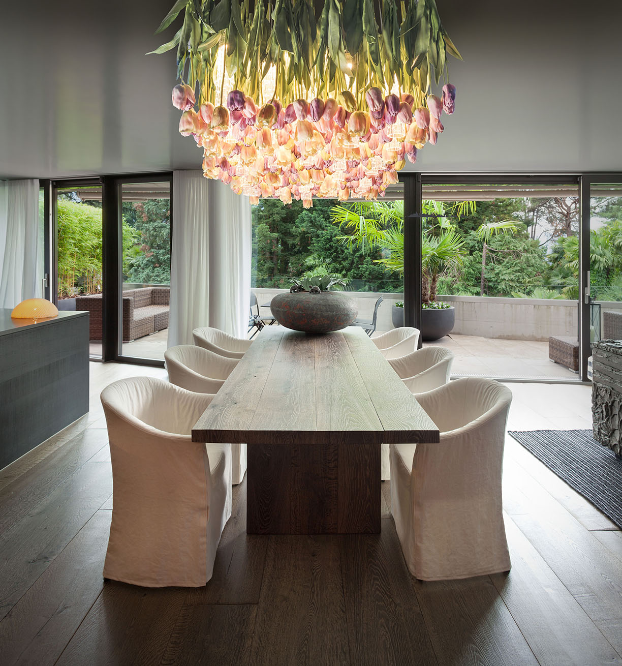
Photo courtesy of VG New Trend
When it comes to lighting, many chandeliers are starting to incorporate elements of nature to bring a more natural, elegant look. Both of these chandeliers are surrounded by vines and flowers, allowing the natural elements to be woven into the design. While critics may argue that the “unrefined” elements of nature decrease the elegance of the chandelier, these rooms prove them wrong. While remaining luxurious, the chandeliers’ design provide a warmer and more relaxed atmosphere.
Natural elements can also be incorporated into the wallpaper of a room, adding a bold yet comfortable piece to the space. Regardless of the individual’s style, nature-oriented wallpaper can be incorporated.
For a more feminine look, a bold, floral wallpaper does just the trick. The bright colors add a fun and relaxed style, while the natural elements of the flowers freshen up the atmosphere of the room.
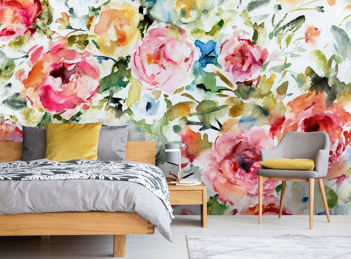
Photo courtesy of Wallsauce
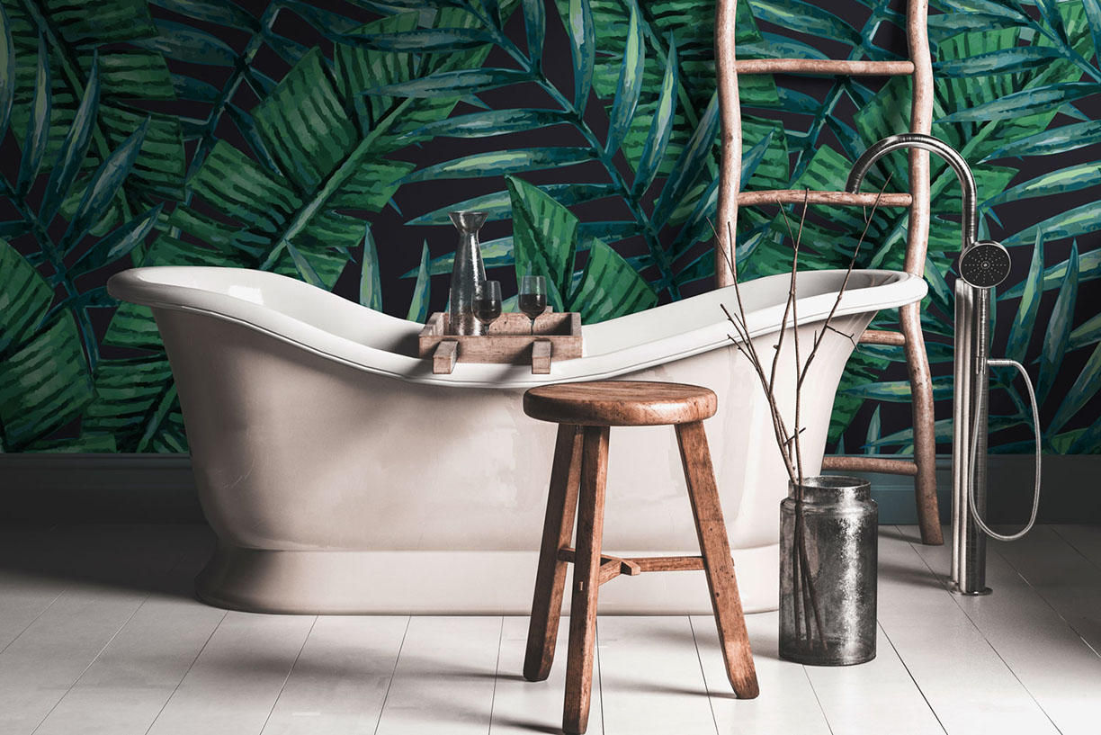
Photo courtesy of Wallsauce
If you’re looking for a less feminine wallpaper, however, incorporating nature to the room is certainly still possible. The darker wallpaper in this bathroom, although much less feminine than a floral backdrop, still adds natural elements to give the room a fresh look.
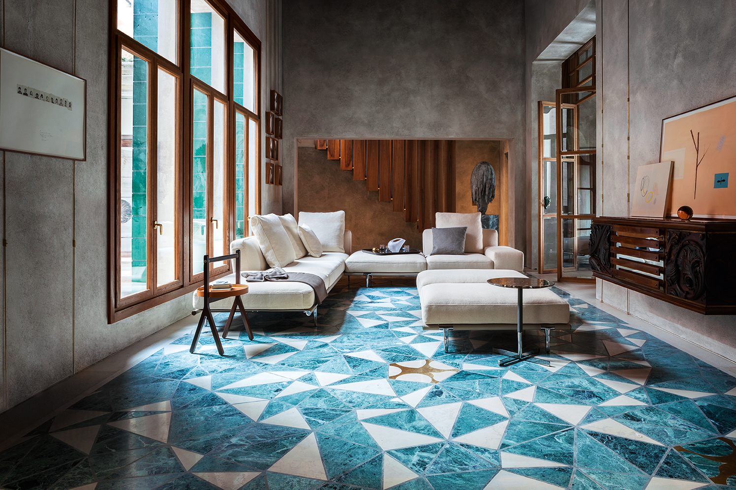
An often underrated way to style a room with is the flooring, which often ends up as a simple hardwood or tile design. While adding neutral tones to floors can allow other statement pieces in a room to pop, sometimes a bold flooring can be just what the space needs.
With that, here are some tips and tricks to designing a room around a bold floor or rug:
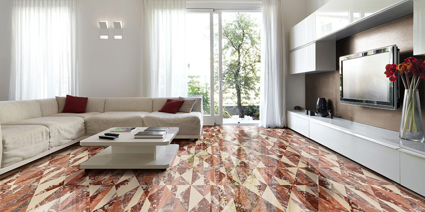
Photo courtesy of Lithos Design
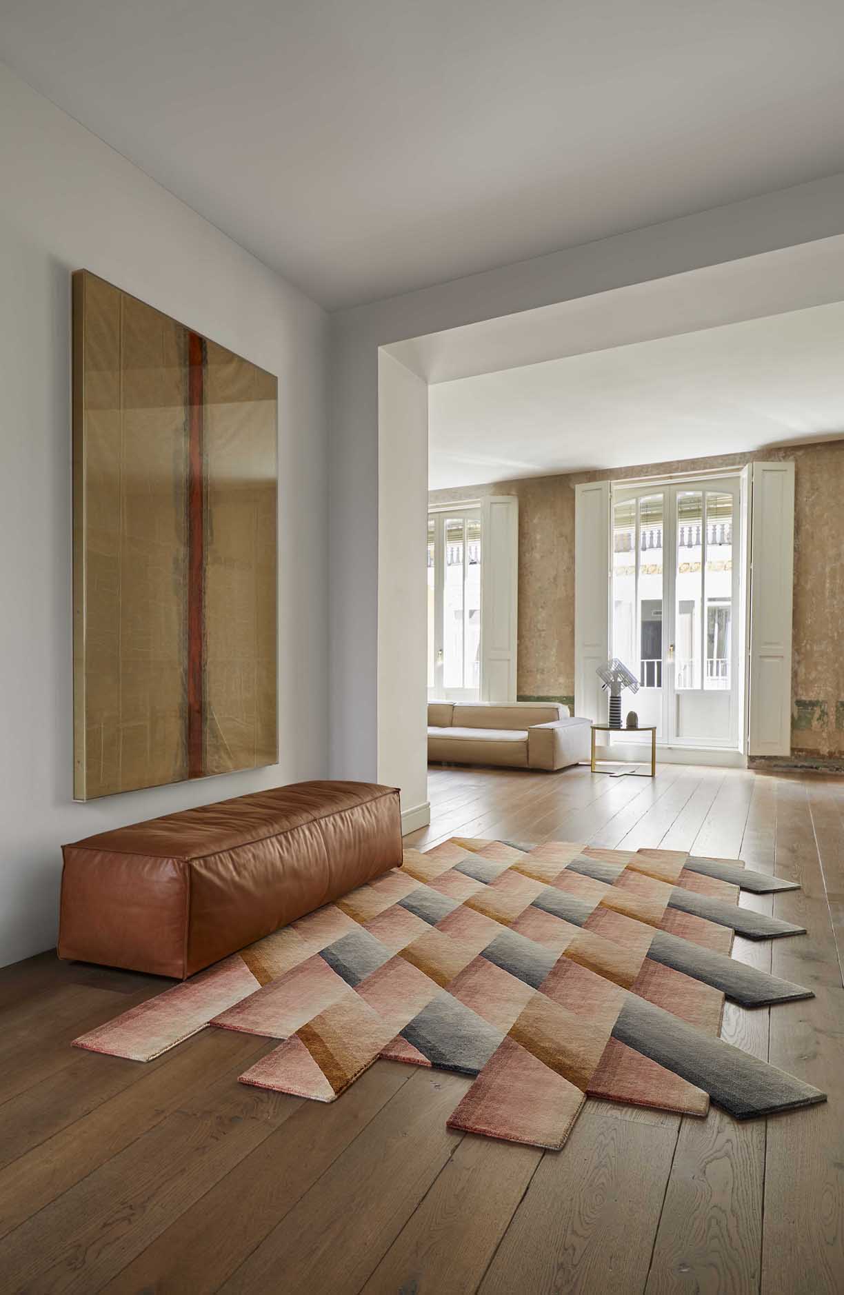
Photo courtesy of Chaplins Furniture
1. Matching Colors
When wanting to design a room with a statement piece, it’s always important to choose the piece that will pop before designing anything else. This way, you’ll know the colors and fabrics involved with the statement piece, and can design around that. In terms of flooring, a bold rug can make or break a room. Choosing the bold rug before anything else can ensure whatever you choose for the rest of the room will complement it.
With this space, the bold rug has two main colors, with gold being its secondary color. Instead of choosing another blue for the chairs, the designer chose to use the rug’s secondary color. This way, the blue rug still adds a pop, rather than being one of pieces with a similar color in the room. By using one of the more minor colors on the floor, there is still a wide variety of hues to have a creative and comfortable style.
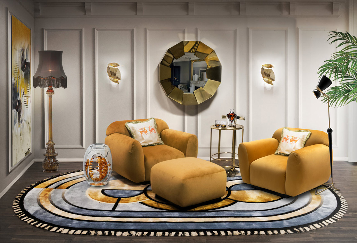
Photo courtesy of RugSociety
Photo courtesy of WOW Design
2. Sleek and Airy
By allowing the bold floor pattern to be the centerpiece of the room, the designer creates a light and airy atmosphere. Instead of cluttering the room with more designs and colors, the simple designs allow for the bold floor to stand out. The minimalist look along with various plants adds a sleek and refined style to the room while also adding just enough color to keep it vibrant.
The chevron floor interlocking tile and hardwood floors adds a one-of-a-kind design for the individual to enjoy. With the only other colors in the room being a hint of black and green, the minimalist design keeps the style interesting while also comforting in its simplicity. Keep this design in mind if you’re looking for a minimalist style with an added statement piece.
3. Eclectic Style
Don’t be afraid of flooring that gets colorful and different. When styled correctly, this can be the selling-point of the home. Its uniqueness never fails to impress those who are looking for something different yet clean and airy.
While this tile may look busy and complicated close up, take a step back and see the beauty it adds to the home. The mid-century modern design adds a flair unlike any other, while also staying sleek and refined.
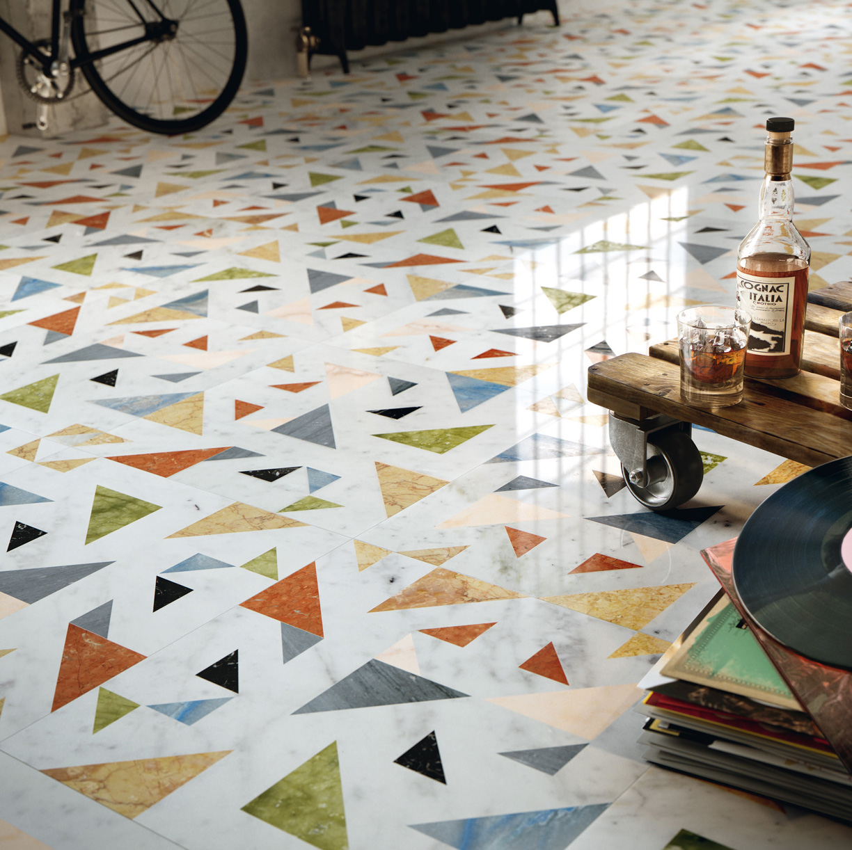
Photo courtesy of Lithos Design