Photo by Alem Sánchez.
With literally millions of shades and hues to play with, color can also be intimidating. In a recent post by Northeast Meetings + Events, a series of experts give their professional advice on how to utilize color to enhance an entertainment venue and decoration. Fulfill the entertainer in yourself with their insight!
Expert advice varies on if there should be a color limit or if there’s a perfect strategy to picking colors. But when you do, internationally recognized color expert Leatrice Eiseman suggests starting with one lead color. “Then build the other colors around it.” And always take into consideration the existing room’s colors and lighting. “Whatever the venue is you’ve got to take into consideration what is already there that is immovable. What could you do to draw attention away from or disguise a presence of color that really is interruptive?”
As Director of the Eiseman Center for Color Information and Training, and the executive director of the Pantone Color Institute, Eiseman definitely has the know-how on color. She says that early in her career people outside of fashion didn’t pay much attention to color. “When I started out I’d often meet with a bunch of engineers sitting there with crossed arms,” she says. “But people have realized the psychological impact color has. … Color is a very important aspect of any work you do across design industries.”
When using color in decor, for events or otherwise, consider the mood you want to establish.
Photo by Kaboompics.com
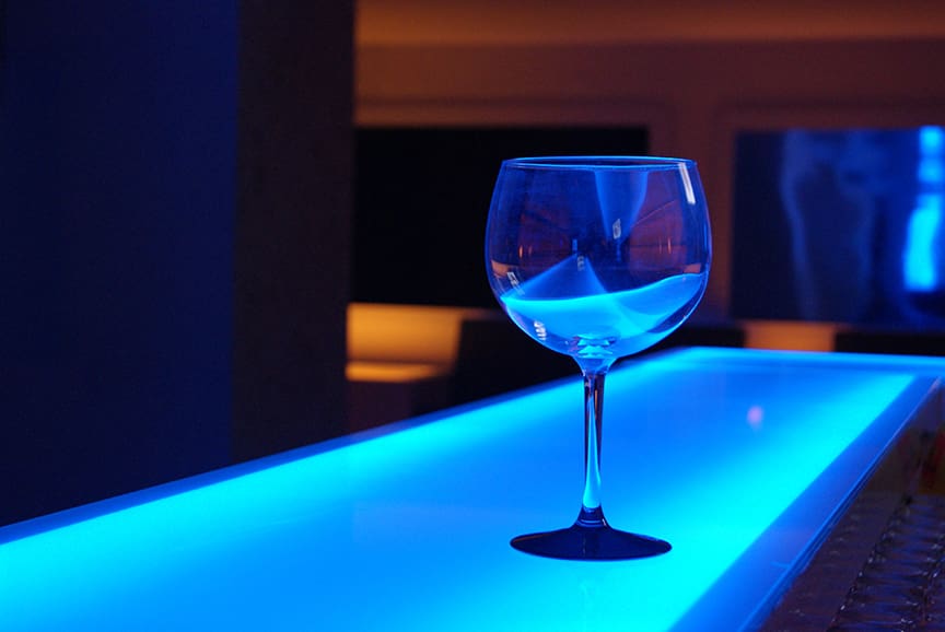
“The use of cool colors and hues such as blues can help calm and relax individuals and generate clearer and a more relaxed mind-set, great for business sessions,” says Sarah Kelly, senior event producer with Cantrav Services. She often incorporates color to set a mood. “While the use of warmer colors and hues such as ambers and reds can help stimulate and generate a more active and warm response, great for team-building or brainstorming sessions,” she adds.
Photo by Pixabay.
Photo by Designecologist.